Personal Projects: Portrait & Identity // Conceal & Reveal
Initial Ideas & Thoughts
Quote on Portraiture |
Quote on Identity |
Quote on Conceal & Reveal |
Portraiture

|
“A good portrait ought to tell something of subject’s past and suggest something of his future.” This is a quote in which I chose which for me shows a lot of meaning for portraiture in photography. The reason why I chose this quote is because it symbolises that a picture can show a lot of emotion of a person by the look of their face and the images colour. Black and white shows darkness and then bright colours mean happiness. There are many different techniques for portrait photography. Often it is desirable to capture the subject’s eyes and face in sharp focus while allowing other less important elements to be rendered in a soft focus. At other times, portraits of individual features might be the focus of a composition such as the hands, eyes, or part of the subject’s torso. This shows that portraiture doesn’t always have to be the emotion on the face it can also be the emotion of your body, it can be the way your body looks or even feel but by the quote a good portrait is from the past and in the future.
|
Identity

|
“In the social jungle of human existence, there is no feeling of being alive without a sense of identity” This is a quote in which I chose which for me shows a lot of meaning for identity in photography. The reason why I chose this quote is because it symbolises that everyone needs a sense of identity in their life to have a feeling of being alive. The first part of the quote “In the social jungle of human existence” shows that’s its ok to be different from other people as that’s what make you, you. A photographic identity allows you to reveal yourself, to stand out among the crowd of photographers, to ensure your individuality and your irreplaceable artistic fingerprint.
|
Conceal & Reveal

|
“We reveal our joys and successes, we conceal our pain” This is a quote in which I chose which for me shows a lot of meaning for conceal and reveal in photography. The reason why I chose this quote is because a person can quickly identify your emotions by your body language and your faces. Therefore ‘Conceal and reveal’ is very important in modern day life as that’s the way it attracts more people onto the pictures.
Conceal =To hide something from view or from public knowledge, to try to keep something secret. Reveal= to uncover; to show and display that which was hidden. |
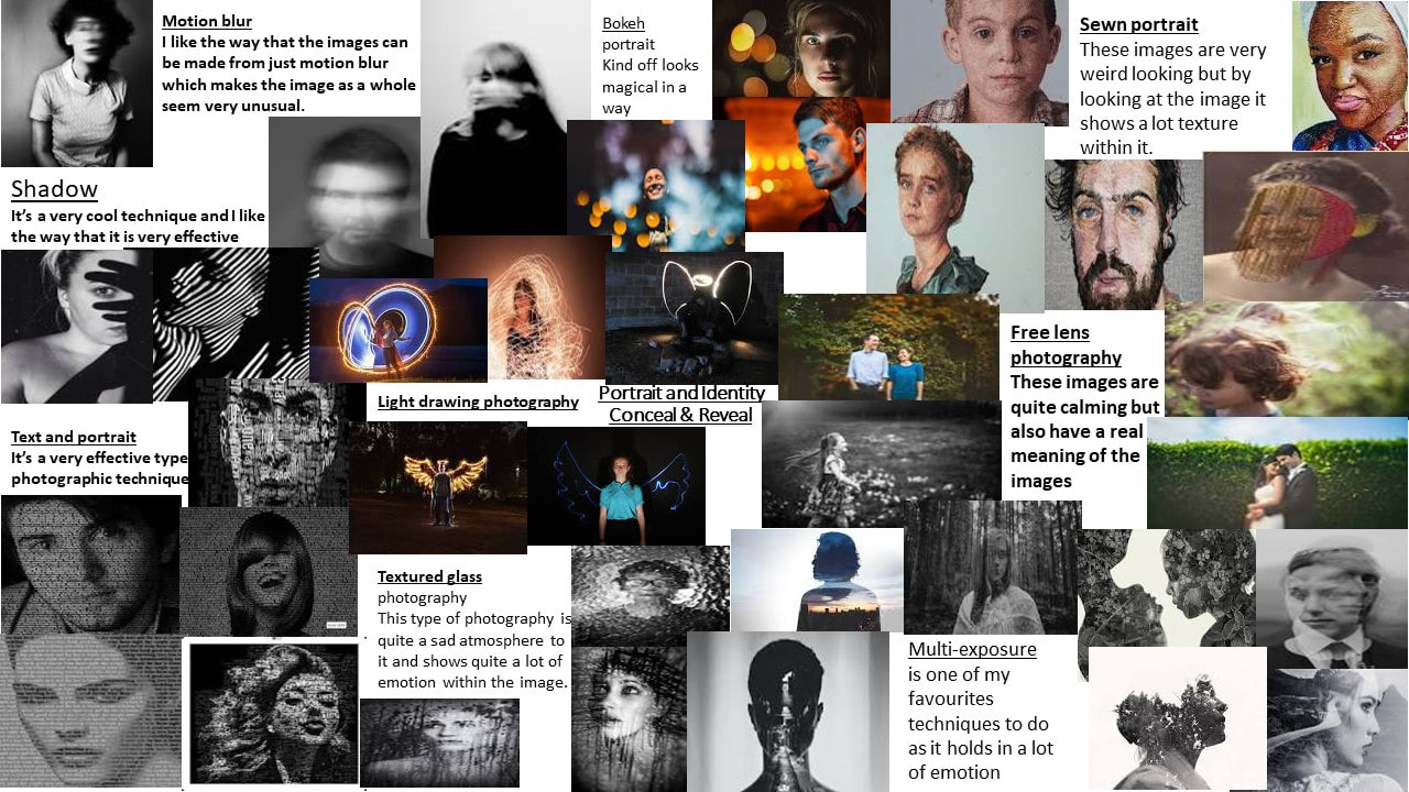
Initial Research - Word mind map & Video's

|
|
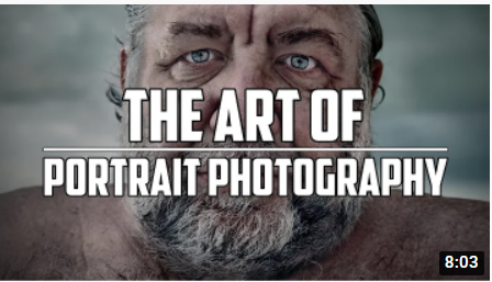
Initial Research - Photographic Techniques
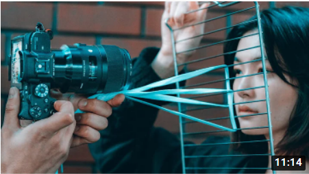
Initial Research - Experimental Portrait Photography

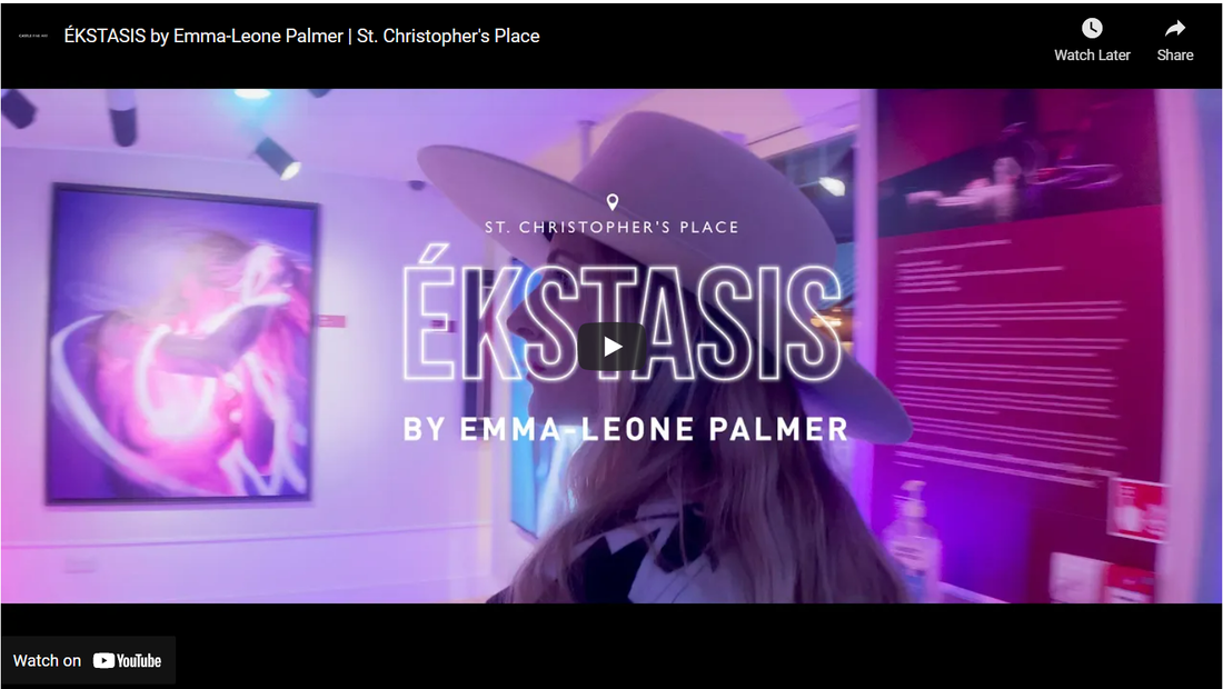
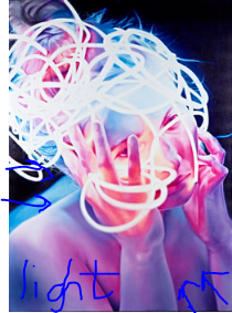
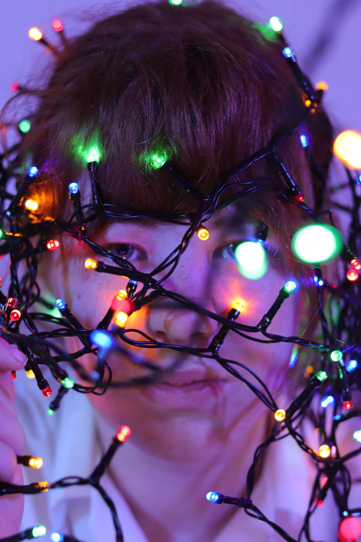
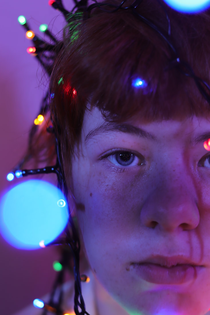
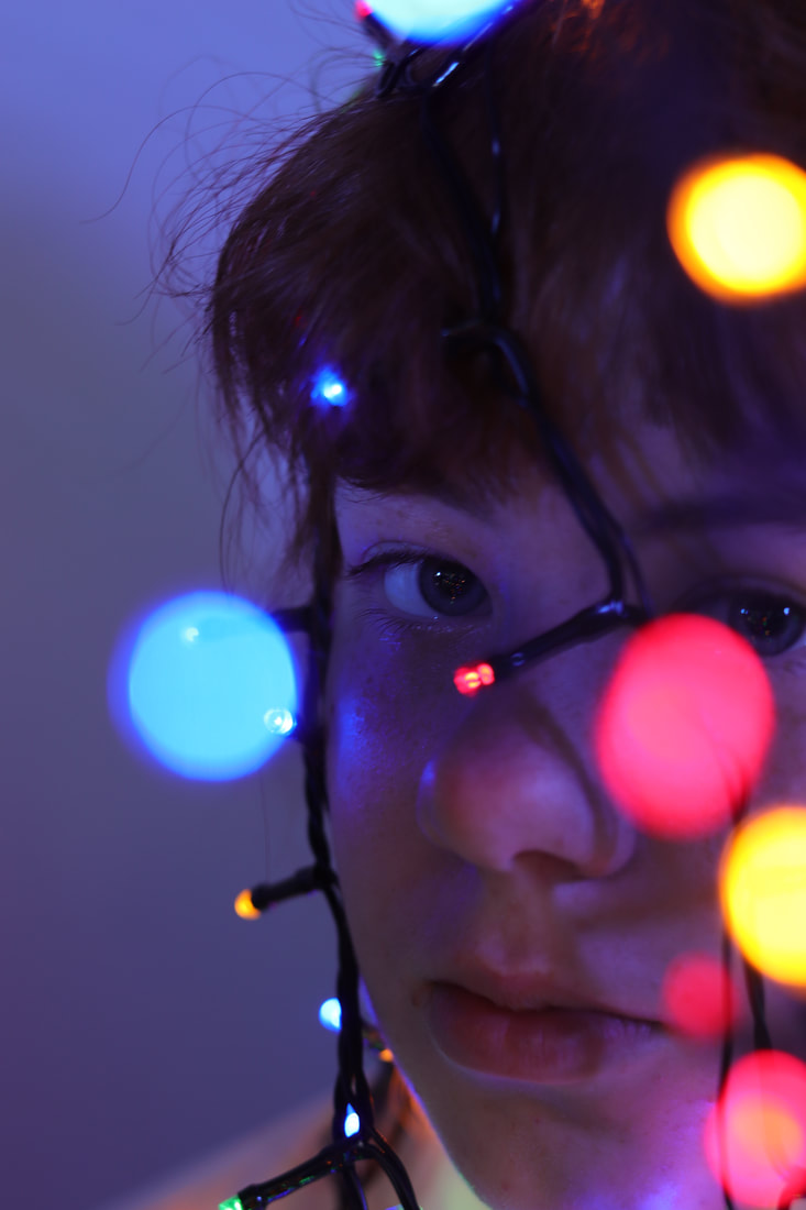
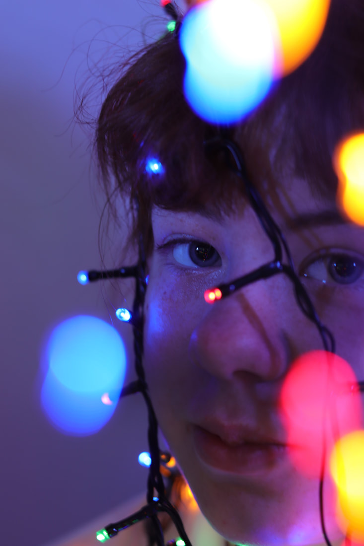
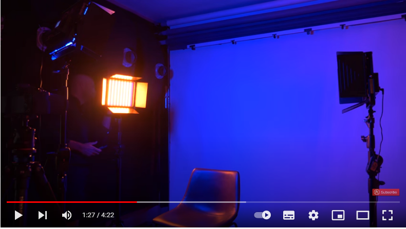
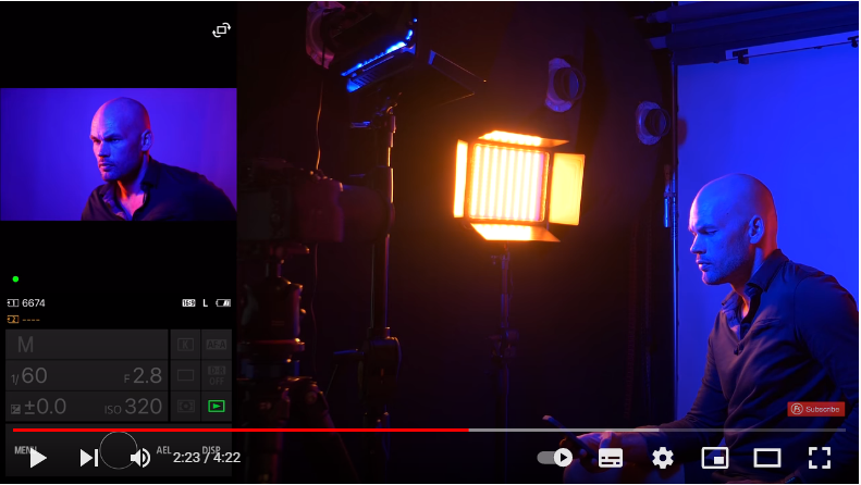
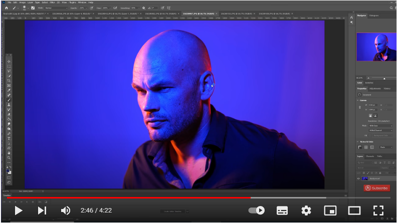
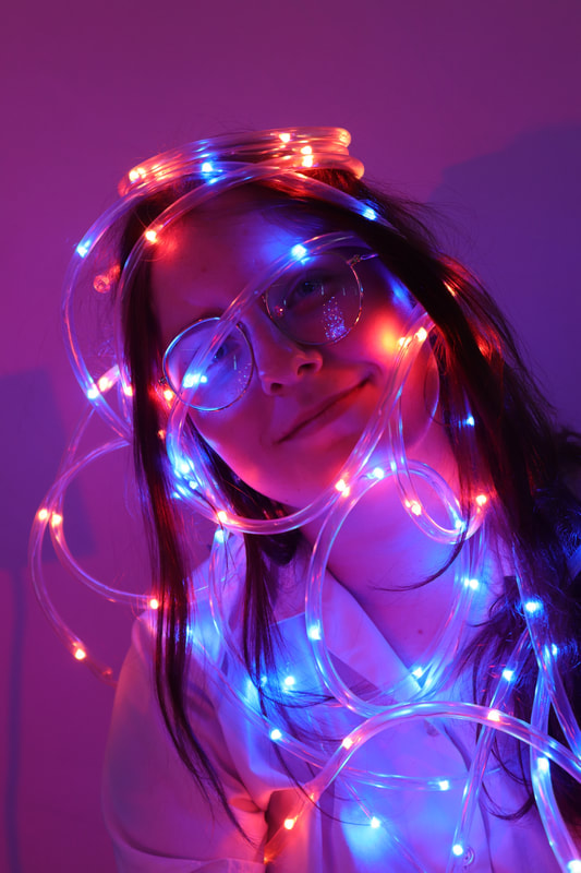
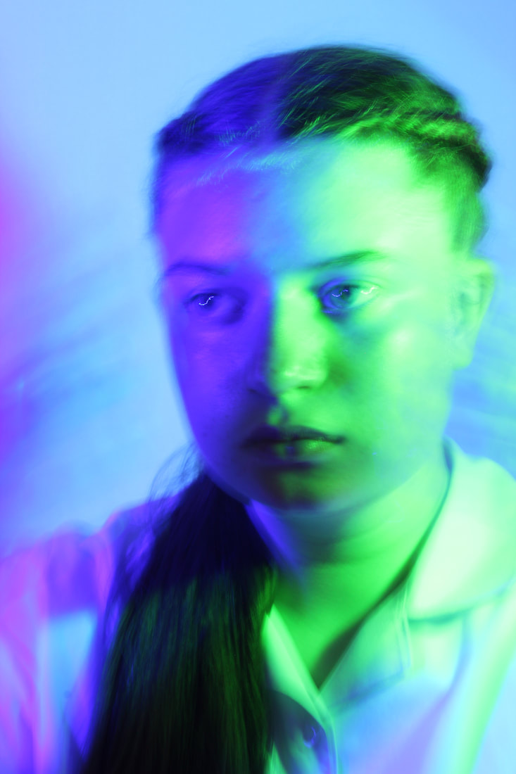
Conceal & Reveal / Light - Emma-Leone palmer


“When you’re in the dark, it’s like a warm blanket: you feel safe, but also it feels a little bit dangerous, a little bit naughty.”
After graduating with a fine art degree in 2005, Emma moved to Umbria in Italy, where her love of figurative painting blossomed at a studio once used by the High Renaissance painter Raphael. She went on to hold a solo exhibition of 38 portraits at the Watts Gallery and appear as a contestant on Sky Arts Portrait Artist of the Year, where she painted the film star Richard E. Grant. Her work is also owned by the British Olympic swimmer Sharron Davies.
Spiralling across each of the large-scale paintings from her Afterglow collection is a seemingly chaotic entanglement of neon wires. Allegorising not only the complexity of our thoughts but the digital information we receive and process on a daily basis, these bursts of light illuminate the female subjects whilst deepening the darkness they inhabit. The scale is deliberately larger than life to impose and make us confront the feelings of the women.
Exuding vibrancy and sensuality, her latest release, ÉKSTASIS, is a celebration of losing ourselves in the moment and embracing the magic of being alive. Through her fearless paintings, Emma-Leone Palmer explores the synergy of art, music and light; with rhythm pulsing through her veins, she has pushed the possibilities of oil paint to combine the canonical painting modes of the Renaissance with the hyper-neon colours of the 21st century.
Creating contrast between darkness and luminescence through chiaroscuro – a technique used by artists including Caravaggio – Emma uses light as an allegory for energy. She explains: “I’ve got to make my own energy. I am alive, and I want to paint paintings that make me feel alive. I’m going to be colourful, bold and totally me.”
Emma adds: "I’ve never been a mid-tone person: I love the highlights, the juicy little pop bits, and the darkness. ÉKSTASIS is about uplifting energy, and how we are projecting it forwards, upwards and outwards. This is what happens when you stop editing yourself and just exist. And it’s addictive."
|

|
“Some are created in times of desperation and feeling lost, some with a rippling sensuality, some whilst I dance with music and fun pulsing in my veins.”
This technique appeals with me because of the exposure. The exposure is very important within this technique because the light's show the audience the emotion within the picture and that it wouldn’t look right if the image was dark and there was LED lights on their because LED lights are meant to lit up the room. Normally this picture would have a dark exposure but adding in those LED lights, brightens up the picture a lot more giving the picture a high exposure and more of a happier feeling within the image.
This artist links in very well with the topic what we are doing now 'Portrait & Identity Conceal & reveal'. This is because Emma-Leone Palmer uses emotion in the photograph by people's bodies and faces while wrapping LED lights around their body to add more effect to the image. Dark colours to represents sadness and anger and light colours to represents happiness and happiness is the effect for Emma-Leone Palmer work as she is using bright colours (LED lights) in her work.
This artist links in very well with the topic what we are doing now 'Portrait & Identity Conceal & reveal'. This is because Emma-Leone Palmer uses emotion in the photograph by people's bodies and faces. She also uses LED lights to show the people's emotions. Dark colours to represents sadness and anger and light colours to represents happiness.
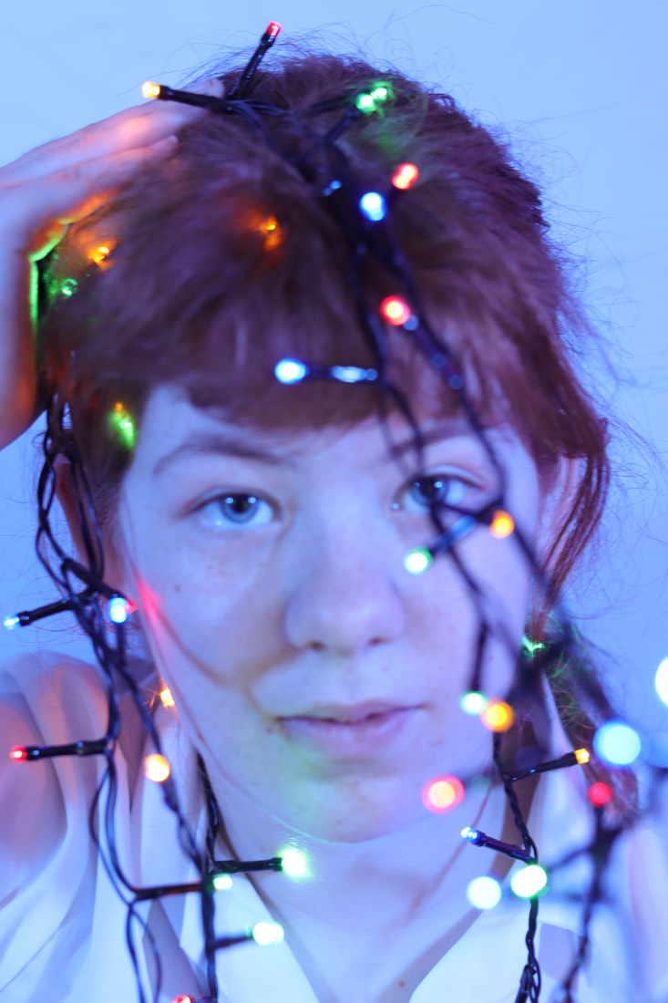
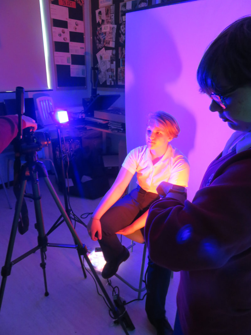
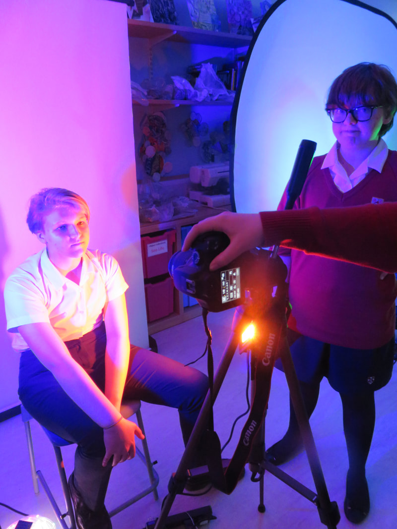
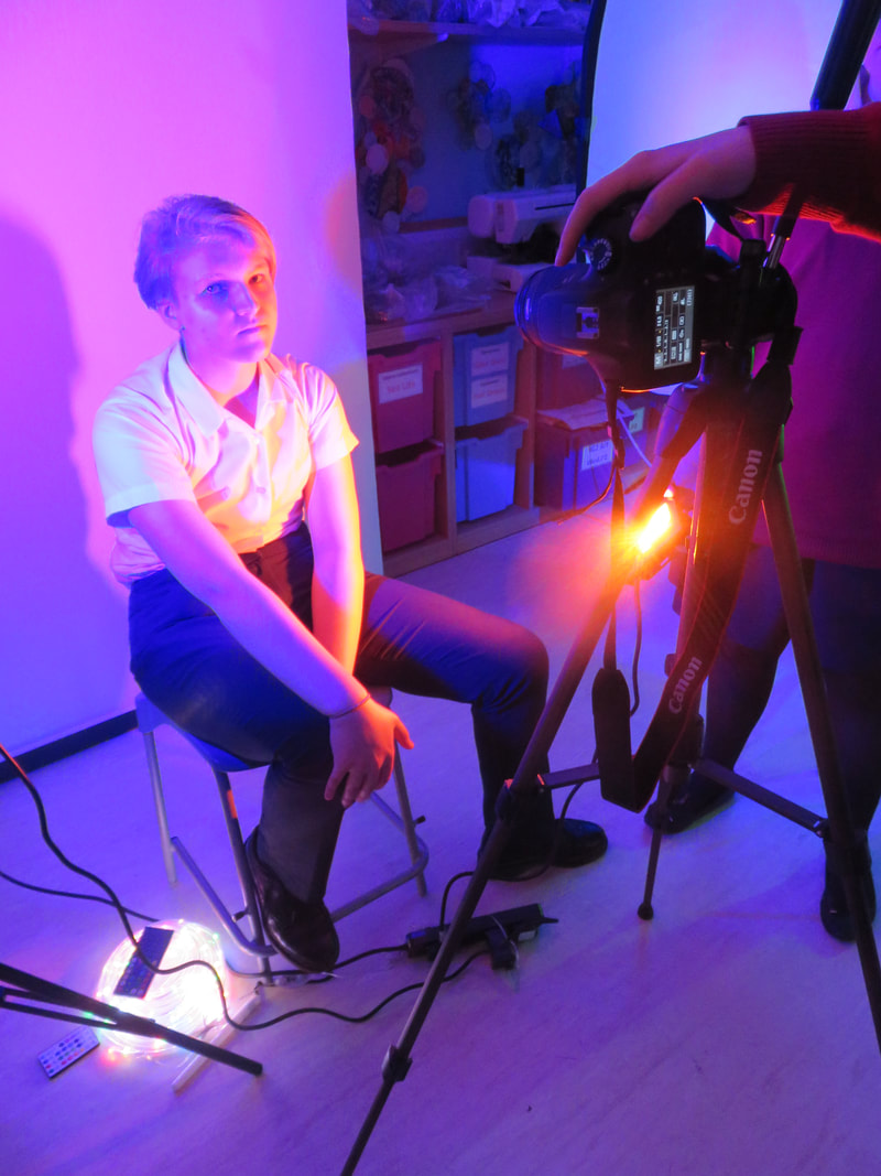
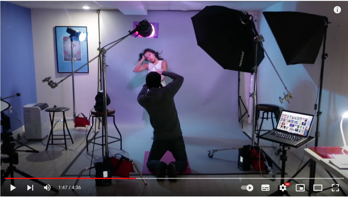
To emulate Emma -Leone Palmer I will need some LED lights to represent the lightness in her work. I would also need a white drop so there would be no background. This is so the background wouldn't distract the actual photo. You would not want a lot of patterns in the photo as there would be too many things going on at the same time.
To emulate Emma-Leone Palmer work I will need a large amount of LED lights so you will be able to wrap around the body of your model. It might be good as well to get two or more LED lights so you are not just using one colour of the LED light instead you may be able to use two LED colours to create more effect. Another thing is that you wanna ask your model to wear plain clothes as you don't want their clothes to distract the picture as the whole as the image is already very busy with the LED lights. To make it less crowded you would also might want to get a backdrop which will go in the background of your image. A backdrop is a white background, this is good as the background wont distract the image again. The white colour will also calm the image down a bit so the image won't look to busy but to calm as well.
To emulate Emma-Leone Palmer work I will need a large amount of LED lights so you will be able to wrap around the body of your model. It might be good as well to get two or more LED lights so you are not just using one colour of the LED light instead you may be able to use two LED colours to create more effect. Another thing is that you wanna ask your model to wear plain clothes as you don't want their clothes to distract the picture as the whole as the image is already very busy with the LED lights. To make it less crowded you would also might want to get a backdrop which will go in the background of your image. A backdrop is a white background, this is good as the background wont distract the image again. The white colour will also calm the image down a bit so the image won't look to busy but to calm as well.
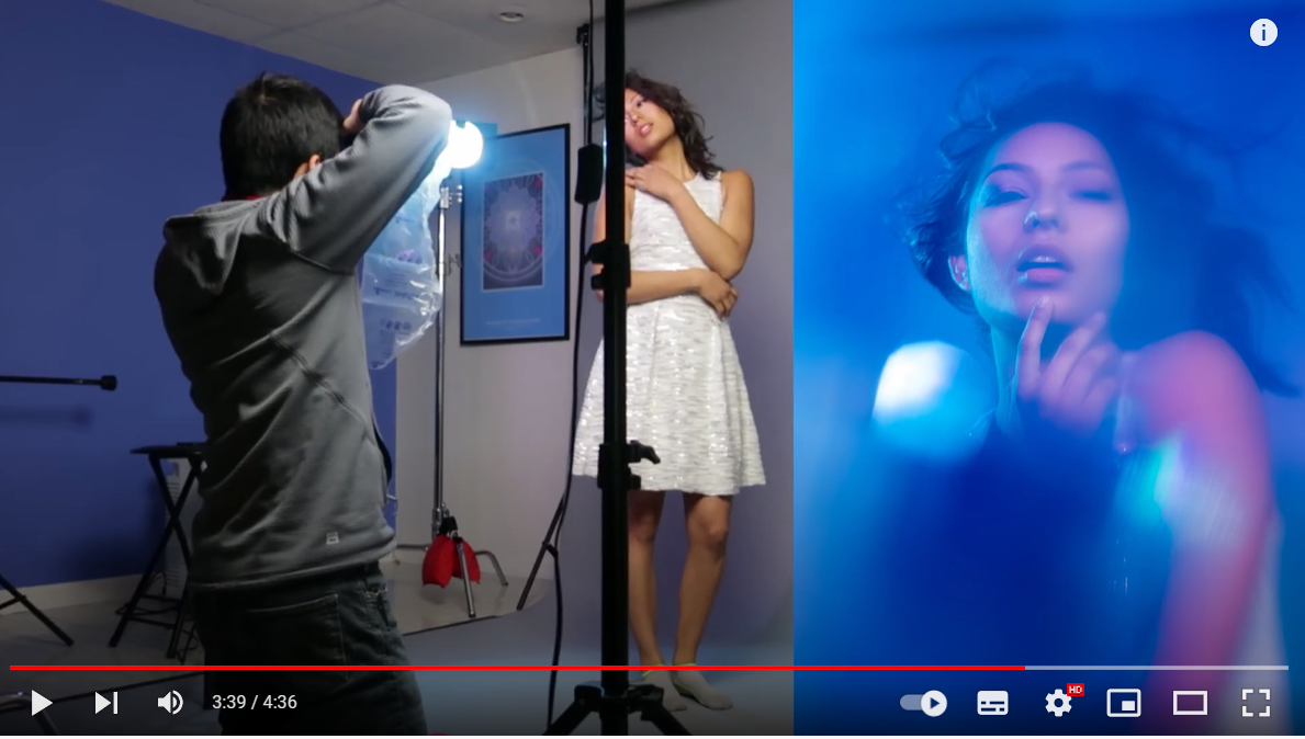
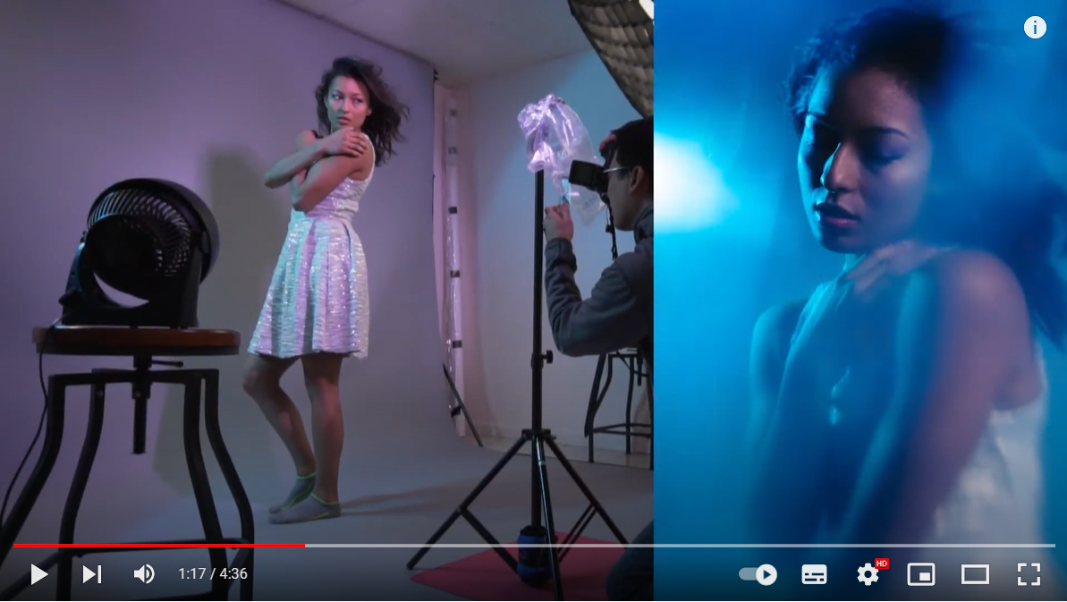
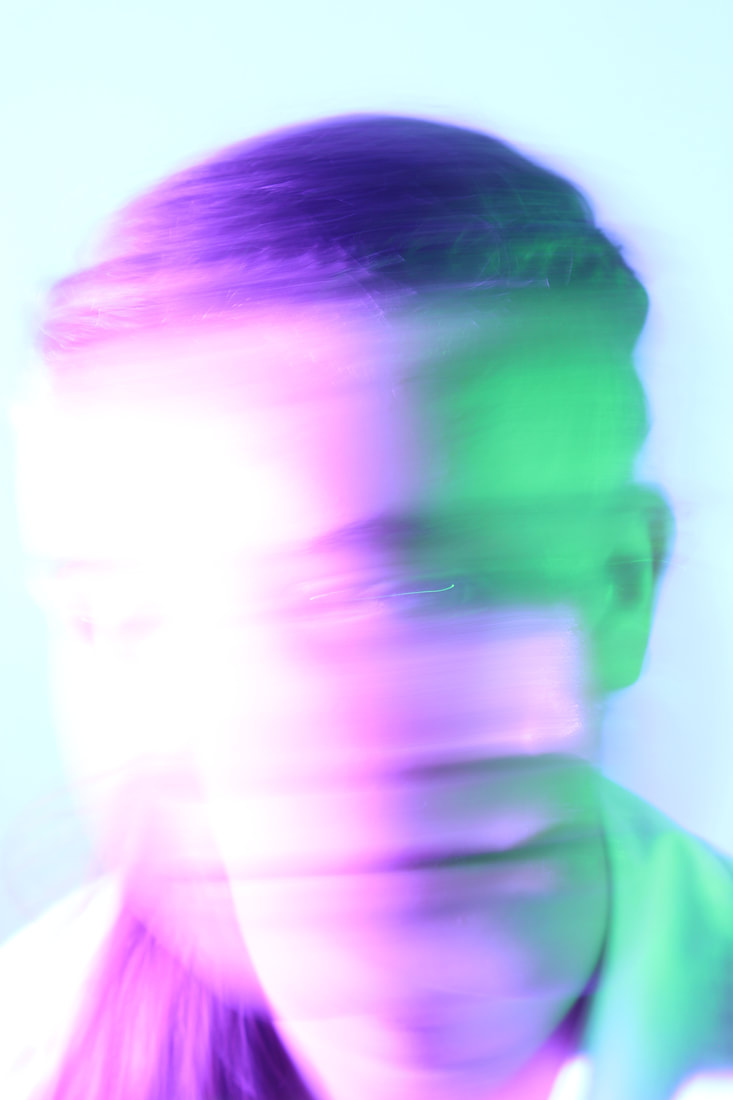
Semi Analyse - Emma Leone Palmer


|
Subject
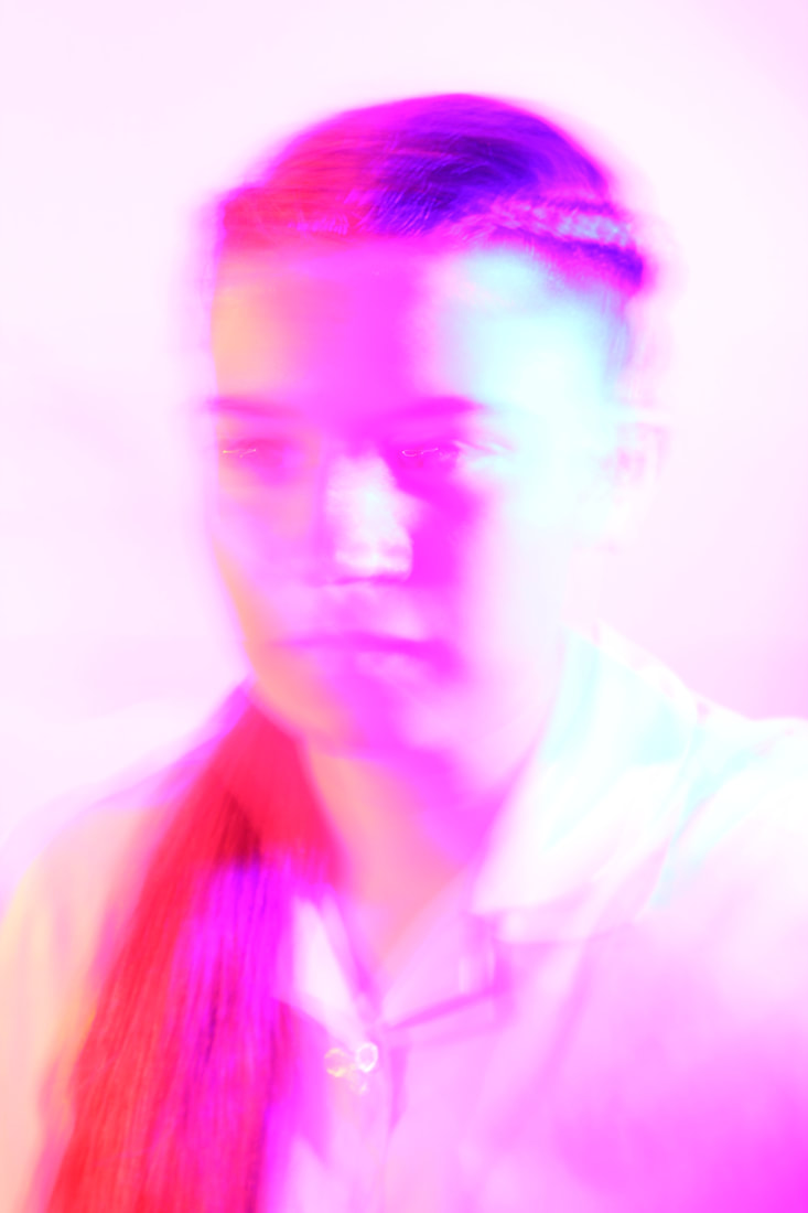
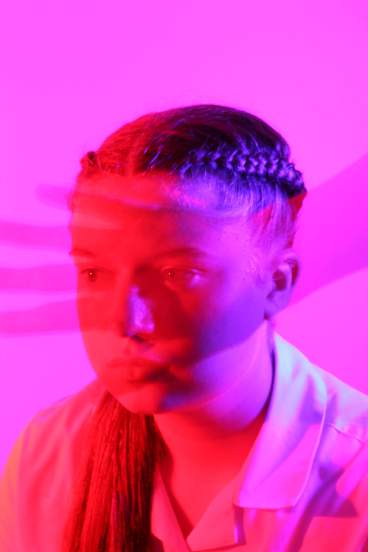
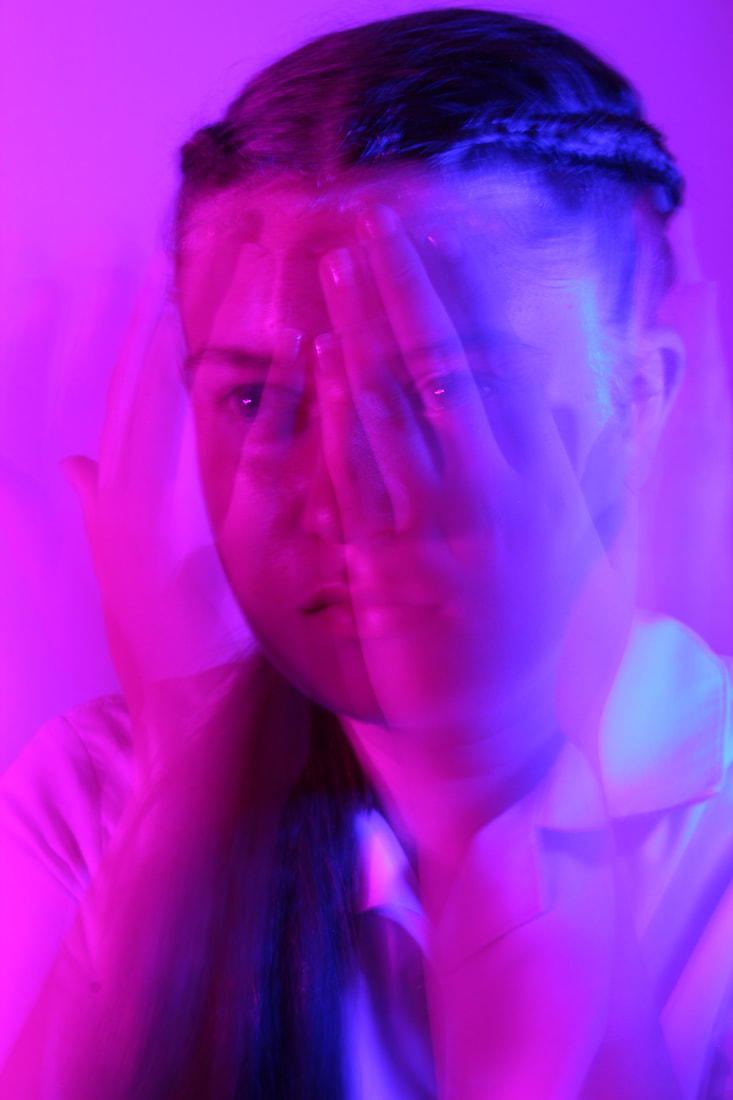
The photographer of this image is called Emma-Leone Palmer. This image was a part of the afterglow series of which she created with only LED lights . The genre of this photo is portraiture as it links in very well with the photography topic Portrait and identity conceal and reveal. The props I can see in this picture is a model and some LED lights which is wrapped around her head for massive affect. Elements The composition of the photo shows that the face of the model is placed the centre of the image. The LED lights are placed in the foreground all blended in with the face and hair. The viewer's eye is lead around the photo because of the composition and perspective Emma-Leone Palmer has used. The perspective that she has taken the photo from is eye level. This perspective is effective because you can see the whole details of this image for example the face and the hair but also the colours of what the LED lights are on and that they look like they are all tangled up rather than them being straight. The photographer employs a range of visual elements in her work. The most striking elements are colour, texture and line. I think that colour is the most obvious element in the photo because of the light what the LED lights have made. These LED lights has made loads of different colours which blends nicely with the photo and the reflection on what the lights have made onto the model. I think that texture is also the most visual element in her work because of the texture of her hair and body. As they both look very realistic. Lastly I think that line is the most obvious element in the photo because of how much LED lights there is on the picture even though the LED lights are all tangled up. The LED lights show line but also shape with the shapes of what the LED lights make when hey are all tangled up. Media The photo has been taken from a short distance so you wont be able to see a lot of the background of the picture. This is so the person and the LED lights are the main focal points of the image. The person has been placed in the middle ground. By doing this the viewer's eyes are lead to the lights first as that's the part of the picture which stands out the most. Then the eyes would lead to the body of the picture as the skin is a different colour from the real life skin. Lastly the viewer's will then lead to the background which is very plain which is good as it won't cause any distractions to the viewer's eye's. The photo has been taken using a studio using the sunlight to decide which way the light would come in from the picture. The light source is placed on the left which is doing highlights on the left side on the person's body. This creates an atmosphere because it's making the picture look like there is a person behind her but its only one. As well it's adding in a lot more light to the picture but also a lot of colour as well. To emulate this photograph myself , I would need some LED lights to wrap around my model to give the photo more of a colour effect. We can also use a RGB light to get more colour into the picture. The problem is with Emma-Leone Palmer is that she paints these picture so there would be no camera settings. While shooting these images I will need to be indoors as I will need to create loads of different colours. Intent I feel the photo coveys a message of that it's ok for you to be different then anyone else. You don't need to compare your body to anyone else's body as everyone is different. This photo is giving me an energetic feeling. It does this by using a lot of colour in her work. I love this picture as it is using lot's of colour to catch the viewers attention. Emma-Leone Palmer is also using a lot of line within the LED lights. |


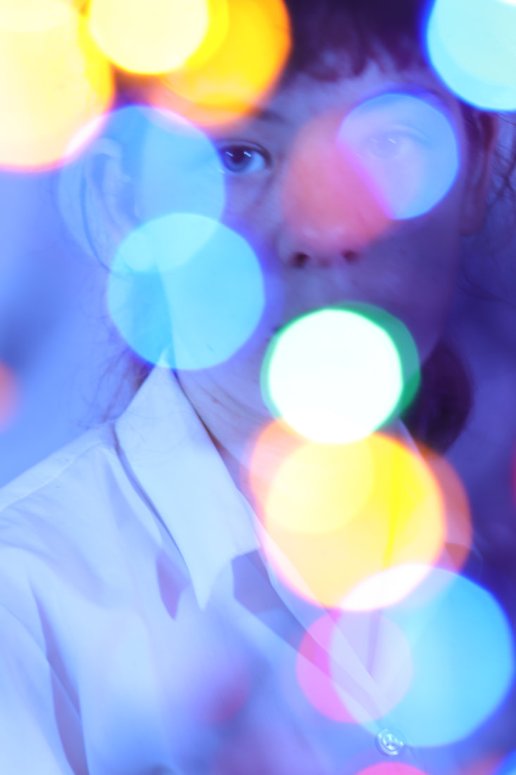
Experimenting with light: Bokeh Workshop

|
Bokeh, also known as “Boke” is one of the most popular subjects in photography. The reason why it is so popular, is because Bokeh makes photographs visually appealing, forcing us to focus our attention on a particular area of the image. The word comes from Japanese language, which literally translates as “Blur”. The bokeh effect is produced when the foreground and/or background is intentionally blurred around a subject. It can be achieved by using adjusting a camera’s aperture for a shallow depth of field. The bokeh effect is anaesthetic choice and tends to five images a dreamlike appearance. The term bokeh was first introduced to the photographic world in 1997 in photo technique magazine. Bokeh is defined as “the effect of a soft out-of-focus background that you get when shooting a subject, using a fast lens, at the widest aperture, such as f/2.8 or wider.”
During this photoshoot we want to emulate the Bokeh work to look like the model is actually outside when actually we was in a studio using any lights you have got at home or which are cheap in a craft store. Before we started the photoshoot, we will need to set up the studio with three important things. The first one is that we will need a tripod to keep the camera sturdy and still to prevent the photo being out of focus. The second thing we will need will be some lights to put in front of your camera lens to make it bokeh. To do this you will need a shutter speed of 1/90 of a second. (ISO 400). Lastly, we will need a lens which has a very wide aperture (50mm F1.4). Lastly, we will have to shoot in Manual mode because if we let the camera do all of the exposure then the lights are going to confuse the built-in light meter, and the whole exposure will be wrong. |


we will have to shoot in Manual mode because if we let the camera do all of the exposure then the lights are going to confuse the built-in light meter, and the whole exposure will be wrong.
|

During this photoshoot we want to emulate the Bokeh work to look like the model is actually outside when actually we was in a studio using any lights you have got at home or which are cheap in a craft store.
|

This shows the difference before using Bokeh and what the picture looks like while we are using Bokeh.
|
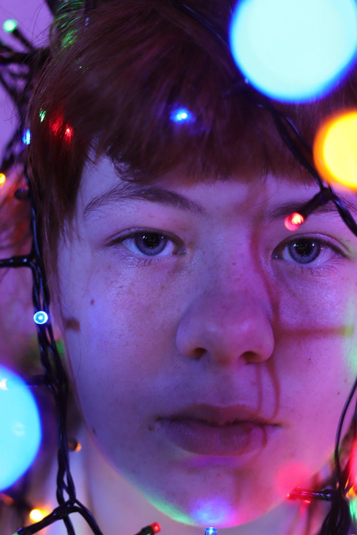
Experimenting with Light : Bokeh Contact Sheet
Experimenting with Light : Bokeh Workshop 9 images
The reason why I chose these 9 pictures is because it has some sort of a Bokeh element to it. Even though, Some pictures has loads of Bokeh in while some Pictures has not a lot of Bokeh it. Overall, I have chosen quite a variety as some you can see the lights on the image whereas some you can't as it's right in front of the camera lens.
|
|
|

|
|
|
Experimenting with Light : Bokeh Workshop 4 Edited images
I chose these 4 pictures from the 9 pictures at the top because in some part of the picture there is a lot of detail of either the fairy lights or the Bokeh. As well in some pictures you can find both fairy lights and Bokeh but in those pictures there isn't a lot of them so it's not that crowded from the rest of the 4 pictures.

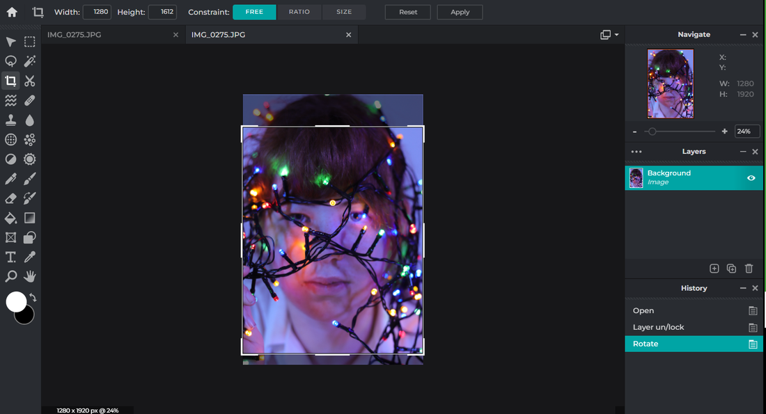
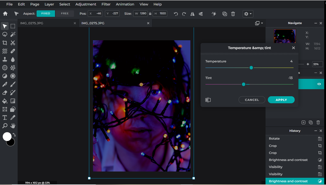
Firstly, what I did to this picture was that I cropped the image using the rule of thirds. This helped by making sure each square has some sort of detail in it so it will attract the audience a lot more. I also wanted to crop the hand as it was to distracting for the picture and as well it didn't really have a purpose to be on the picture. Then I changed the Brightness and the contrast of the picture which made the picture a lot more darker. To make the lights stand out a lot more I changed the temperature and tints. This makes the picture stand out more.
Overall, I am very happy with the ending of this picture even though this picture isn't really Bokeh. I did have to do loads of changes to this as some things make the picture stand out a lot more but some things doesn't contrast with some other parts of editing. |

Firstly, I cropped the picture so then there isn't any blank spaces as the aim of the image was "Bokeh". While cropping I didn't want to take away the Bokeh look so I didn't crop that much of the image from the last image I did. To make the Picture a bit more brighter I used the brightness and contrast so then I can still see the model but we can also see the Bokeh surrounding the model. If the picture was dark then you wouldn't be able to see the model but just the Bokeh. I also changed the levels of the photo to make the photo more lighter but a bit dark at the same time.
Overall, I am quite happy with the ending of this picture because I would of liked to make more changes to the photo, but it didn't really blend in with the rest of the changes. |

Firstly, I decided to crop the photo a lot more than the rest of the photos. This is was because you could see a lot of the white blouse which distracted the photo. Then I changed the brightness and contrast so that the picture is light which then you can see a lot more detail on the face but also you will be able to see the Bokeh. If the photo was dark then there wouldn't be that Bokeh effect that I am trying to emulate in the photoshoot. Lastly I decided to use the level tool on Pixlr E to darken the picture a bit so that the first thing the audience will see will be the bokeh effect.
Overall, I am very happy with the finished project as it does fit in with the Bokeh technique in light photography. The one thing which could be improved is when doing the photoshoot to add more Bokeh to the photo by adding more fairy lights into the picture. |

The first thing I wanted to do with this photo was to crop down the left side of the photo. This was because the hand was showing to much and was distracting the picture, So I cropped it down a bit but not all of the hand as the hand shows some detail to the picture but not a lot. I also wanted to crop down some of the bottom half so that the audiences focus is on the face and the lights as that the main objective of the Bokeh technique. Then I wanted to change the brightness and contrast to make the picture a bit more darker to catch the colour of the fairy light a lot more.
Overall, I am quite happy with the finished project but I do wish to make the photo a bit more darker to catch more of the fairy lights. As well I would like to have some Bokeh techniques in the picture as well as the fairy lights. |
Experimenting with Light : Bokeh Workshop Best Image

|
strengths
I really like the final outcome of this picture. I love the way that the background is dark which captures all of the bright fairy lights in the picture. This gives the picture much more detail while also using the rule of thirds to help me expand on the detail. Another thing which captures the detail is the different colour background. If the background just plain white then there wouldn't be that much detail going into the picture but because the background is a different colour it blends in very nicely with fairy lights. Weaknesses The weaknesses of this image is that its not really to do with Bokeh as it's not got any detail of the light or blur effect. When editing I would of not liked cropping the image but if I didn't cropped it then there wouldn't be this much of detail as there would of been blank spaces where there will be no fairy lights on it. To Improve To improve on this image, I would of added some Bokeh effect onto the picture. I will be doing this by putting some fairy lights in front of the lens to catch the effect. Another thing is that I would of liked to spread the fairy lights a lot more as at the sides the fairy lights are very clamped together. |
Experimenting with Light : Bokeh Workshop/ Edited Process
|
Cropping
Temperature and tints
|
Brightness and Contrast

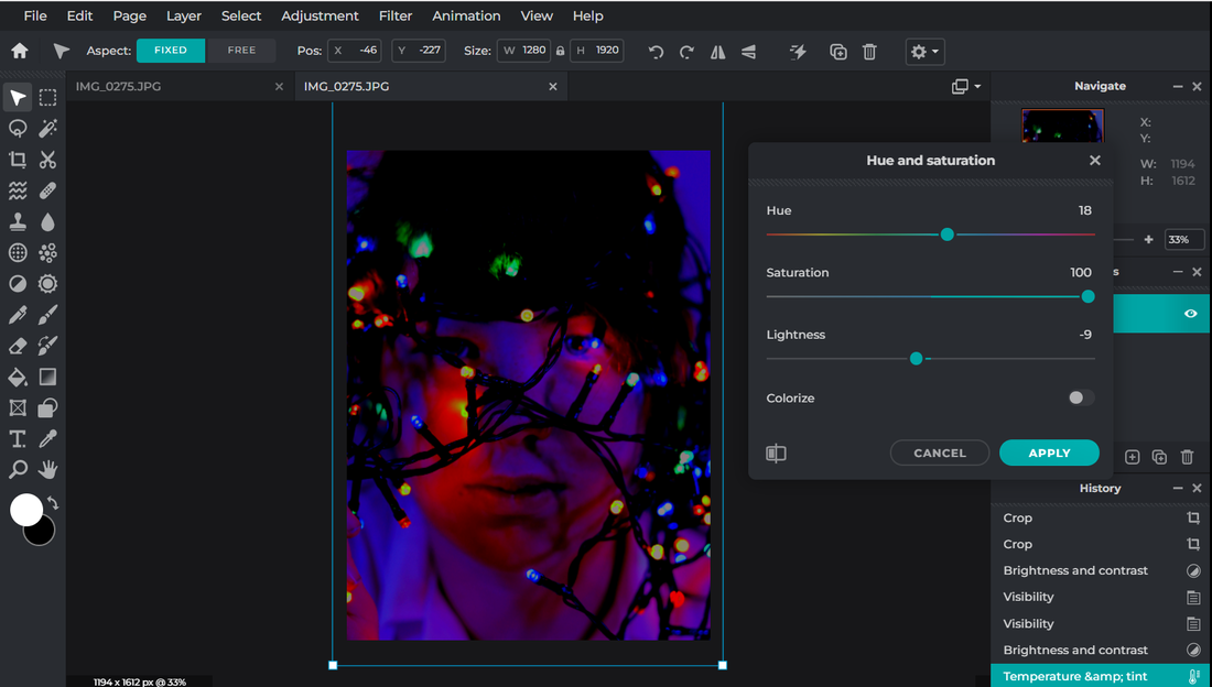
Hue and Saturation
|
Experimenting with light: RGB Gels Workshop

|
RGB lights is simply combining the different intensities of these 3 colours to from multiple parameters (Red, green, blue) to specify colours on the spectrum that human eyes can see.
Colour gels (also known as colour filters) are thin, square-shaped pieces of coloured transparent material used to place over a lighting source. Visual artists use colour gels to control the colour in their work. People have been practising colour gel photography since the 1600s Photography lighting plays a major role in capturing colours as well as in revealing form and texture in an image. Examining daylight is a great way to understand certain characteristics of light: the hardness or the softness of the source, direction of light, and visible colours. |
Re-creating this technique: RGB Colour Gels
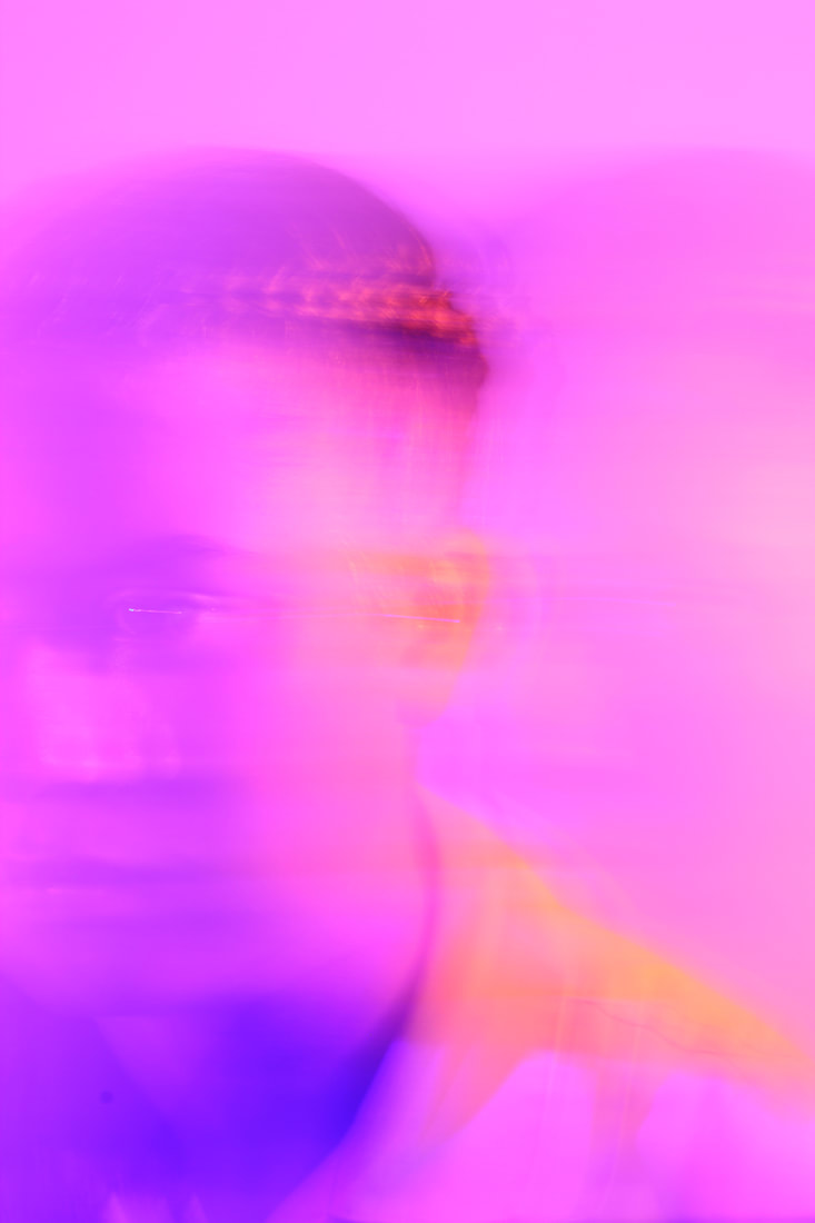
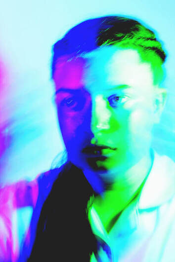
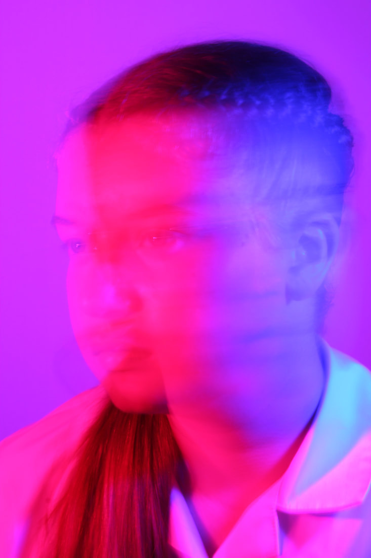
In this video the guy is using one of the cheapest RGB lights there is which is the GVM-50RS. For most of the work using RGB lights people don't tend to ask their models to look straight into the camera lens. Instead they normally look 3 quarters away from the camera which also gives the effect of two colours on the models face. You have to be careful with the RGB lights because if you want complementary colours you can use the colour wheel. This works by choosing a colour and then looking straight across the colour wheel to get the complementary colours. For this photoshoot he used F2.5 and 1/60 per second for the shutter speed.
In this video the guy is using one of the cheapest RGB lights there is which is the GVM-50RS. For most of the work using RGB lights people don't tend to ask their models to look straight into the camera lens. Instead they normally look 3 quarters away from the camera which also gives the effect of two colours on the models face. You have to be careful with the RGB lights because if you want complementary colours you can use the colour wheel. This works by choosing a colour and then looking straight across the colour wheel to get the complementary colours. For this photoshoot he used F2.5 and 1/60 per second for the shutter speed.
This picture shows the set up of the photoshoot with RGB lights both next to him
|
This picture shows what shutter speed he uses and how he takes the pictures.
|
This picture shows how he is editing his pictures to make them look metallic.
|
Experimenting with Light : RGB Colour Gel Workshop 9 images


Experimenting with light : RGB Colour Gel Workshop Contact sheets

Experimenting with Light : RGB Colour Gel Workshop 4 Best images
The first thing that I wanted to edit was the brightness and contrast tool. In the original picture the lights from the tube lights were dull and you couldn't really see the light getting to the model. I also wanted the background to be a bit more brighter as the colour is dark. I didn't want to brighten the background to much otherwise you won't be able to see the tube lights. Then I used a tiny bit of temperature and tint tool. This is to change the colour of the lights a little bit more. Finally, I decided to use the exposure and colour balance tool. This is because I needed to to darken up the atmosphere so you can see the tube lights clearly.
Overall, I am very happy with the result. The one thing what I can improve on next time is to choose colours that go well together. Another thing is that I could use a different colour for the background (not a dark colour) so we can see more of those lights coming through. 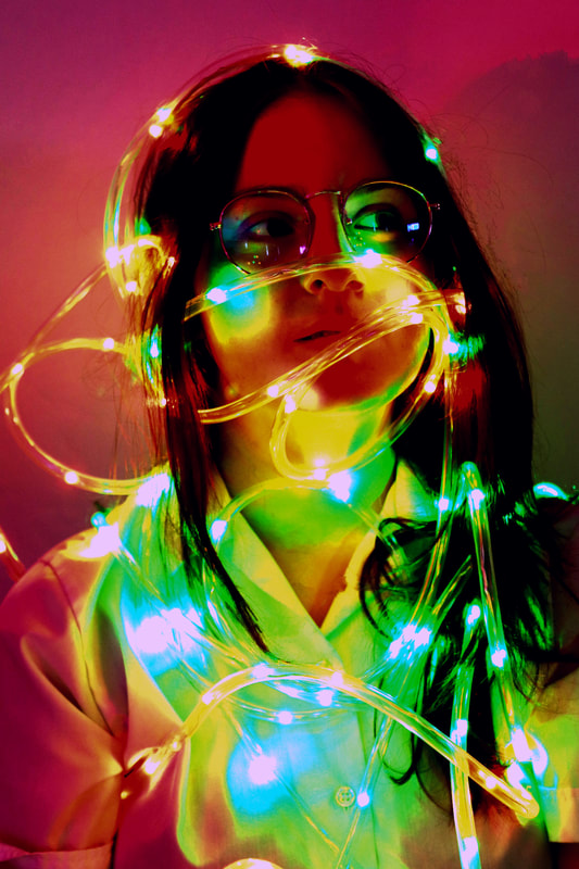
The first thing what I wanted to do when editing this picture was to brighten up the tube lights. On the original photo the colours from the tube lights were very dull and you could hardly see them. When brightening up the tube lights, some of the colours from the surroundings changed but that made the photo more effective to the audience. Another thing what I used was the brightness and contrast tool. As well as brightening the tube lights I wanted to also brighten up the surrounding (background). This makes the picture have loads of warm colours.
The problem with brightening the background is that the lights from the tube lights shows a lot more brightness (Bokeh effect) which is not the aim of this experiment. |
The first thing that I wanted to edit was the brightness and contrast tool. In the original picture the lights were to bright and it didn't fit the tone of the picture very well. In this picture I wanted the feeling of sadness which means lowering the exposure. The main thing is that the colours on this picture are mostly pastel so the audience can see a lot more detail within the photo.
Overall, I am very happy with the results. One thing to improve on is that the light directions. This is because the lights are mostly covering the face of the model which means the audience can't see the emotion that we are giving off (sadness). I would still use the tube lights but making sure not to use them directly in the way of the face. 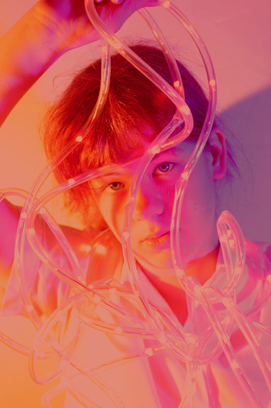
The first thing which I wanted to change was the colours of the lights. On the original picture the colours don't really go well together. (Yellow and blue). To change the colour, I used the temperature and tint tool. This makes the photo a lot warmer as all of the colours are classed a "warm colour".
I am really happy with the results of this photo. There are some changes which I would change next time I do the photoshoot again. The first one is that next time I would like to change the colour of the photo a lot more. I am happy with the finish colour, but I am not keen on just the one colour. I don't think that the one colour is well effective then the two colours. |
Experimenting with Light: RGB Tube Light Workshop Best Image
|
Strengths
The strength in this image is that I love the way the front of the picture is blurry and then the model hiding behind the blurry front. I also like the way that the two colours go really well together and that the colours give warmth to the picture.
Weaknesses The weakness in this image is that it doesn't look like there are tubes in the picture. To resolve this next time, I would like to show more tube lights on the picture to make it more RGB tube Light experiment. 
|
Experimenting with light: RGB Gels & Motion Blur Workshop
|
For a close-up, a shutter speed somewhere around 1/10 sec is about as slow as we can get away with. At shutter speeds like this the motion comes out as blur, but as well as subject movement there’s also a danger of camera shake. A tripod helps, but we can also improve our hit rate by using the high-speed continuous drive mode . The basic technique here is very simple. We need our subject to stay perfectly still while objects around them are in motion. If we use a slightly longer shutter speed than normal, then the motion is recorded as blur. A patterned umbrella works perfectly; gently twirled, it creates beautiful circular streaks of colour.
|
|
|
|
Re-creating this technique: RGB Colour Gels/Motion Blur
In this photoshoot I wanted to capture the movement within the photo to create motion blur .To recreate the RGB Colour Gels/Motion Blur you will need some colour Gels (Cellophane sheets) to put in front of your Lensbaby. The problem with Colour Gels is as you raise the power in your strobes and shoot through the gels. The colour Gel will get closer and closer white. Another problem is that the lensbaby is a manual lens so you have to do a lot of work. For the Depth of field within the picture you can use F.4 or F5.6 to create blur in the picture. To create more blur you can use air bubble bags to create more blur and a prism to add some additional reflections .If you want to "drag" the shutter (slow it down so it can be a longer exposure) you can use 1/5 to 1/6 of a second. Always be changing your shutter speed and your aperture and your strobe power as it's something to experiment with to make the photo better next time you do the photoshoot.
In this photoshoot I wanted to capture the movement within the photo to create motion blur .To recreate the RGB Colour Gels/Motion Blur you will need some colour Gels (Cellophane sheets) to put in front of your Lensbaby. The problem with Colour Gels is as you raise the power in your strobes and shoot through the gels. The colour Gel will get closer and closer white. Another problem is that the lensbaby is a manual lens so you have to do a lot of work. For the Depth of field within the picture you can use F.4 or F5.6 to create blur in the picture. To create more blur you can use air bubble bags to create more blur and a prism to add some additional reflections .If you want to "drag" the shutter (slow it down so it can be a longer exposure) you can use 1/5 to 1/6 of a second. Always be changing your shutter speed and your aperture and your strobe power as it's something to experiment with to make the photo better next time you do the photoshoot.
In this picture the man is using an air bubble bag to create more motion blur within the picture. On the left is a picture of when the guy did the air bubble bag techniques
|
This is the set up of the RGB Colour Gels/Motion blur.
|
In this picture the man is using an air bubble bag to create more motion blur as well as using a prism to add more additional reflections.
|
Experimenting with Light : RGB Colour Gel/Motion blur Workshop 9 images
|
|
|
|

|

|
Experimenting with Light : RGB Colour Gel/Motion blur Workshop 4 Best images

Firstly, I used the lasso select tool and selected the hand on the photo, so that I could darken it up to make sure the hand is very clear. Then I wanted the rest of the photo to be bright so it will make the hand stand out a lot more. I didn't want the hand to stand out that much but I wanted the hand to be like a shadow , which looks really good with in the photo. To make the exposure brighter I used the brightness and contrast tool, a bit of temperature and tint and then the levels tool. After brightening the picture, I decided to add some shadows into the picture. That's why you can see some dark bits for example the shirt has some dark bits which blends in with the photo very well.
Overall, I am happy with the picture but I do wish I could of darken up the hand a bit more especially, the wrist of the hand as you cant really see it that much. 
Firstly, I used the brightness and contrast tool to brighten the pink and the blue as they both were too dark to fit in on what I was after. I also wanted to blend the two colours together to catch the motion blur which I was giving in the picture. Then I used the temperature and tint tool to mix up the two colours together, still wanting the two colours to mix a bit and to show a lot of motion blur as you can see in the photo above. As well as wanting the pink and the blue to blend/mix, I also want them to stand out both the same. When I originally took the pictures one colour was brighter than the other which didn't look that affective with the motion blur put in place as well.
Overall, I am very happy with the finished result of this. To change I would of liken to try out with different colours instead of blue and pink just to experiment with different colours. |

Firstly, I used the brightness and contrast tool to brighten up the two colours: Pink and green a lot more as the colours were very dull which then you couldn't see that much of the motion blur within the photo. To make the pink and the green stand out more I used another tool called Temperature and tint which mostly gave different tones on those two colours. Then I used the levels tool to level tool to make the two colours even out a lot more but to make the photo a lot more brighter than usual to capture the motion blur.
Overall, I am happy with this picture but I did wanted the pink to be a lot more brighter like the green as the green is taking over the pink a little bit. 
Firstly, I used the brightness and contrast tool to brighten the pink, the red and the orange colours. I wanted them to blend in well together as I want it to blend in nicely with the motion blur. Which means no sharpen edges as that will ruin the motion blur effect which we are experimenting on. Then I use the temperature and tint tool to brighten up the three colours a lot more but making sure the colours are plain so the audience will still be able to see the motion the blur.
Overall, I am quite happy with the photo, but I would have changed how many colours were let in the picture as the colours are quite distracting to the audience. |
Experimenting with Light : RGB Colour Gel/Motion blur Workshop Best image

|
Strengths
The strengths in this image is that all of the colours on what you can see are bright which blends in nicely with the other colours. I also like the way you can briefly see the hands moving away from the picture in front of the model. This also make the picture look more like motion blurs so the audience knows what this picture is about. Weaknesses The weaknesses in this picture is that the colours don't really go together that well. Next time I could use the colour wheel to make sure the colours go well together. I would also like to have more motion blur with in the picture not just the hand as you can't really see it that much. To Improve To improve I would add more motion blur in my work. I would also like to change the way the motion blur is presented with in the work. Instead of using hands for motion blur experiment with something else. I want to do this because the hands doesn't really show that much motion blur and I want the motion blur within my work to be noticeable. |
Artist Investigation /Laura Williams


|
. Why I choose Laura Williams?
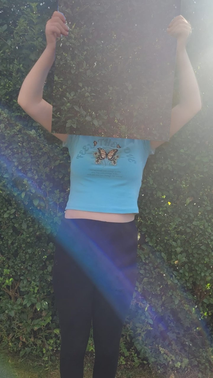
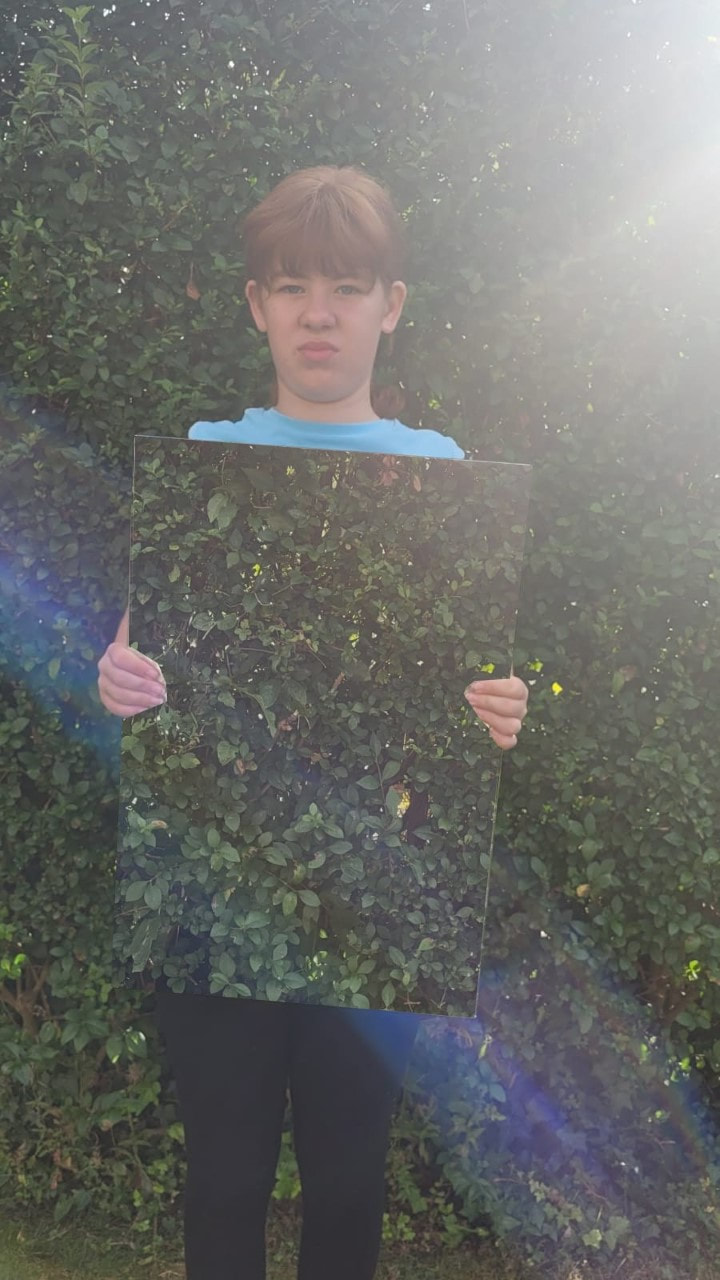
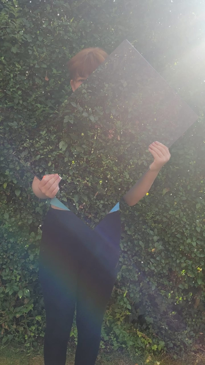
Laura Williams is a fine art wedding photography which she specialises in being very creative within her work. This is very good as I want to get very creative within my photos and my photoshoots which I will do in future projects. Laura Williams creates abnormal portraits: Which she Takes a picture of a plain background, then she takes a picture with the mirror and the model in the picture. "Photography is magic, it allows us to freeze moments that would otherwise be lost. We get to keep those precious moments safe and can relive them again and again. I describe my style as a mix of natural and documentary, with a touch of creative fine art." I really like this quote as this is why I chose Laura Williams as my chosen photographer. I wanted to pick a photographer who is unusual with their photos but also, I want to have a challenge within myself to make myself a better photographer. The processes/Techniques she's famous for? One of Laura Williams collection is called 'INVISIBLE'. She used mirrors reflections as the main concept and to create the feeling that nature is one of the body parts and the idea that human comes from nature and eventually will end at nature. The reflection of the mirror is exactly like the background however I can try this but use the reflection of the mirror, rather than photoshop the original image of the background into the image. This is the technique which I would like to do for a photoshoot. |

|
How to emulate this at home?
To emulate Laura Williams, work at home I will need a mirror to put Infront of the model to work with afterwards when using the editing app PIXLR E. Once I got the mirror that I wanted I then ask the model the stand still Infront of a background while holding the mirror in any position in front of the model. Then I will take the picture and ask the model to stand away from the background while I will keep the camera still and take the picture.
Once I have finished with the photoshoot, I will then open up PIXLR E and start editing the pictures what I took.
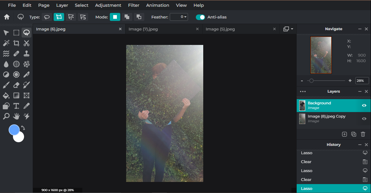
Laura Williams photoshoot - Home
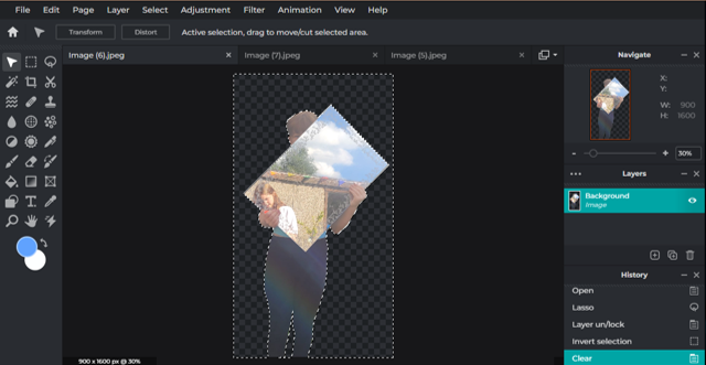
invert and delete background
lasso tool around model
|

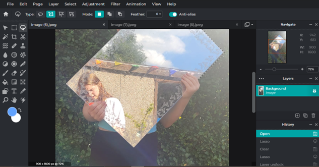
add in background image
cut out mirror, adjust accordingly and flatten image
|
Final Outcome
|
|
|
Physical Composition Design 1
|
What is the aim of this Physical Composition?
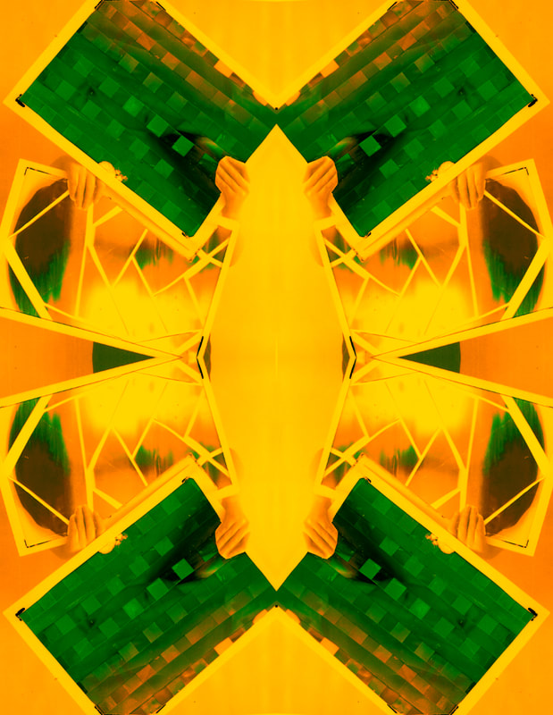
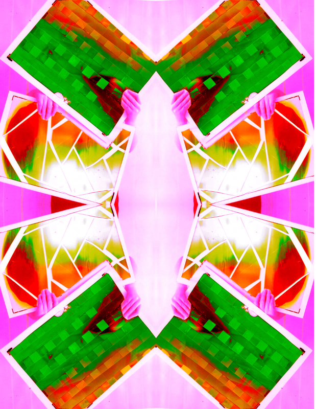
The aim for this physical Composition to have two pictures within one whole image. This will have the feeling of confusion as there will be a lot of things to look at and the image itself will look very busy. This will also add a lot of detail within the conceal and reveal project as their will be an black and white image and then two full colour images to catch the audiences attention. |
"It's one thing to make a picture of what a person looks like, It's another thing to make a portrait of who you are." |
|

|

|

|

|
What physical photographer(s)/techniques are furthering your ideas for Physical Composition 1?
The photographer Laura Williams really inspired me to this Physical composition design. Her style of work is to make the audience confuse as she is using a prop which people may not normally use in their photography work. This is how I got the mirror technique inspiration from but instead of a mirror I will use some white boards to act like the mirror. The areas what I will be focusing on is mainly colour as I want some parts to be black and white and then the images on the boards to be in full colour. |

|

|

|
For component 1 I wanted to copy the idea of Laura Williams and what I did for my summer homework. I wanted to overlay two pictures together of what I did for my motion blur photoshoot on what I did in school. These are the pictures on what I used for the mini photoshoot:
|
|

|
|
These are the pictures what I took of me holding up some white boards to be the layout of the picture:

|

|

|
Once I printed these pictures I then used the the laminator to laminate the pictures so then I can cut the inside out of the board while leaving a boarder. On one of the pictures I forgot to leave a border on it so I decided to experimented with it without having a boarder.

|

|

|
At home I decided to experiment with some techniques what I can do with the pictures:

For this picture I decided to cut the actual picture into different shapes and sizes (Mostly triangles). I decided to cut the up once at a time because I still wanted to see the picture clearly even though there are some which spaces in-between it. Once I cut them one up then I glued it to a small white piece of paper.
The end result looks very good as this was only an experiment one as I didn't plan to do this. 
For this picture I decided to cut stripes from the monochrome picture and glue it to the coloured one. The first problem what I comed from was that the stripes where too big which led the coloured stripes to be thinner. Another thing is that the colours where not that bold which made this picture dull and a bit boring. Afterall this was only and experimented picture and at the end it looked quite good with the borders.
|

For this picture I decided to get two pictures which looks familiar and weave them together while still looking like the actual picture. I kept on adding detail to the picture and layering them which at the end didn't really turn out that well.
The end result didn't as plan as the two pictures doesn't look like the original pictures. 
For this picture I decided to do the same with the last picture which was cut up the monochrome picture into stripes and the glue then on the coloured picture. The first problem what I came across that the stripes weren't straight and that is because I used scissors to cut them up. Another this is that both of the pictures weren't the same length which could have been shown at the bottom of the image. In the end this was covered up by the boarder.
|


Physical editing plan:
The First thing I will need to do is to take pictures of someone with one to two white boards with a white screen in the background. I will then upload them onto PIZLR E and crop the images as much as possible without cropping the white board or the model. I will then like to change the colours of the pictures to black and white so it will very effective. I will then print out the images and laminate them so it is sturdy ready for me to cut into them with a pen knife. Then I will print of some more pictures and layer them onto the original picture moving them until I get the image where I liked them. Then I will use a scanner and scan the images so they are both printed on together,
Outcomes of Physical Editing:
Add images of your physical editing process and annotate your work in detail on Weebly. Scan images.
|
|
|
|
4 Edited Images DIGITAL enhancing
You will now need to edit your images through digital means. Present your best edits on Weebly. Explain how you merged the ideas, identify strengths / limitations and next steps. AGT add in step by step annotated editing screen shots for the development of one image
You will now need to edit your images through digital means. Present your best edits on Weebly. Explain how you merged the ideas, identify strengths / limitations and next steps. AGT add in step by step annotated editing screen shots for the development of one image
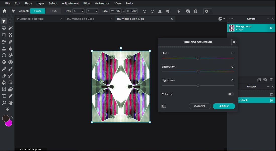
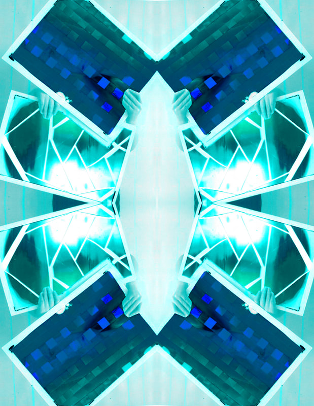
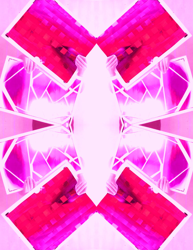
1. First I wanted to change the Hue and saturations of the picture to make it a different colour.

2. After when I changed the Hue and saturation of the picture, I wanted to change the shadows of my picture.
|
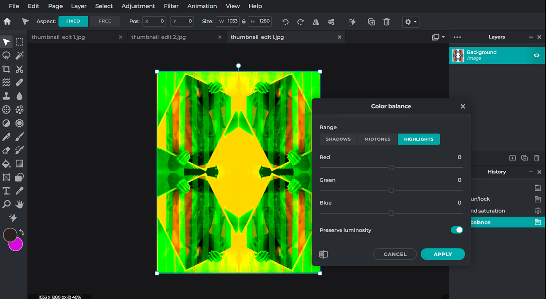
3. Then I changed the highlights of the picture which gave a different colour background which I like but very unusual.

4. Lastly, I changed the midtones of the picture which gave a much calmer background but more colour in the frame.
|
Final Outcome
Present your final physical outcome and evaluate its effectiveness – how does it show portrait and identity
Present your final physical outcome and evaluate its effectiveness – how does it show portrait and identity

|
Physical Edit Final Outcome:
This is my final piece. I am very happy with the outcome of it. Next time to further my piece I would like to make my physical piece a lot neater so it looks more presentable. As you can see one of the frames is covered in glue and whiteboard marker. I would like to remove that so the audience will be able to see my outcome a lot clearer without having a distraction. Although there are some negatives from this picture I really carefully picked my favourite image and I chose this one. The reason why I picked it was because I like the way I used one colour but used different tones of blue within my outcome. I also like the way that the frames are not just blue but the background is too. If the background was just white then it would have been a bit more boring but with the blue background it adds a lot more colour to it. To improve next time, I would like to neaten up my work a bit more so there’s no little mistakes on it. For example, the blackboard marker. To further my skills, I would like to merge two pictures together to create a bigger image. |
Liverpool Trip
What is the aim of this Digital composition?
My aim for this composition is to create the feeling of being unusual as the videos what I chose to go through is quite weird and that you won't be able to see it in everyday life. I don't really want to create the pictures of having a feeling of happiness because the videos don't really show that, but instead it shows a sense of sadness to it as a life has been ripped away from the city.
The videos what I have chosen has a 'ripped' affect to it, but on the video it was meant to be a scary picture which I didn't really wanted to do. I do like the concept of the darkness so that's why I chosen to go for the sense of sadness from a life being ripped apart as that can be quite scary for the audience as well.
Overall for the feeling of my digital composition is that it's a mixture of happiness but also sadness to the picture.
Images to support shoot aim
|

|
|
|
For this video I want to do the same effect of it but switching some things up with it. First of all I will be doing a person and a structural building as that is what I have prepared for in my mock exam. I have also decided not to go with the red eyes and lips as that doesn't really fit well with the structural buildings on what I took on the Liverpool trip. Instead I am thinking of doing one layer black and white and then the other layer just colour but I've not decided on it yet as it depends how much colour is in the picture and how I am going to blend those two pictures together.
|
|
For this video I want to do the same effect but switching some things up with it. First of all I will be doing a person and a structural buildings as that is what I have prepared for in my mock exam. Personally I don't really know how this effect is going to go as it doesn't really fit right with the person along side with the structural building. Another thing what I am planning of changing is the mood. So far, I think the mood is happiness but I want to change it sadness and darkness. Overall I want to keep one layer black and white and then the other layer in full colour to create a good effect.
|
|
For this video I want to do everything the same. I want to keep the mood of this picture as it represents happiness and I can't really change this to any other moods. If I have time in my exams I would like to experiment with different exposures. The main picture being full colour and the the building picture to be black and white.
|
Liverpool trip Contact sheets
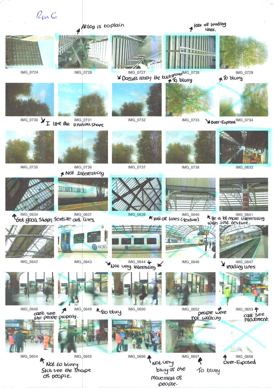
|
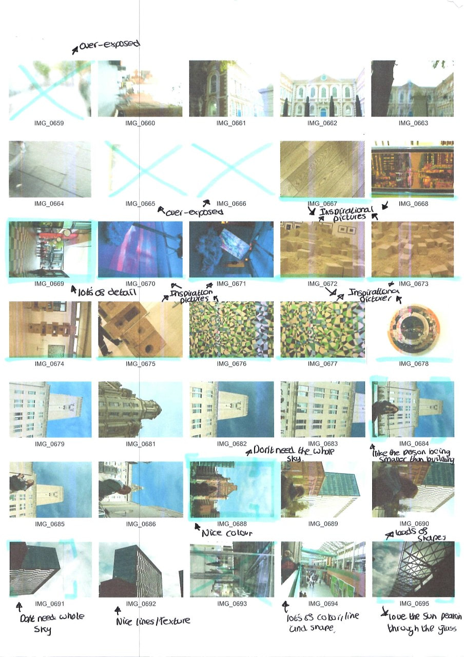
|
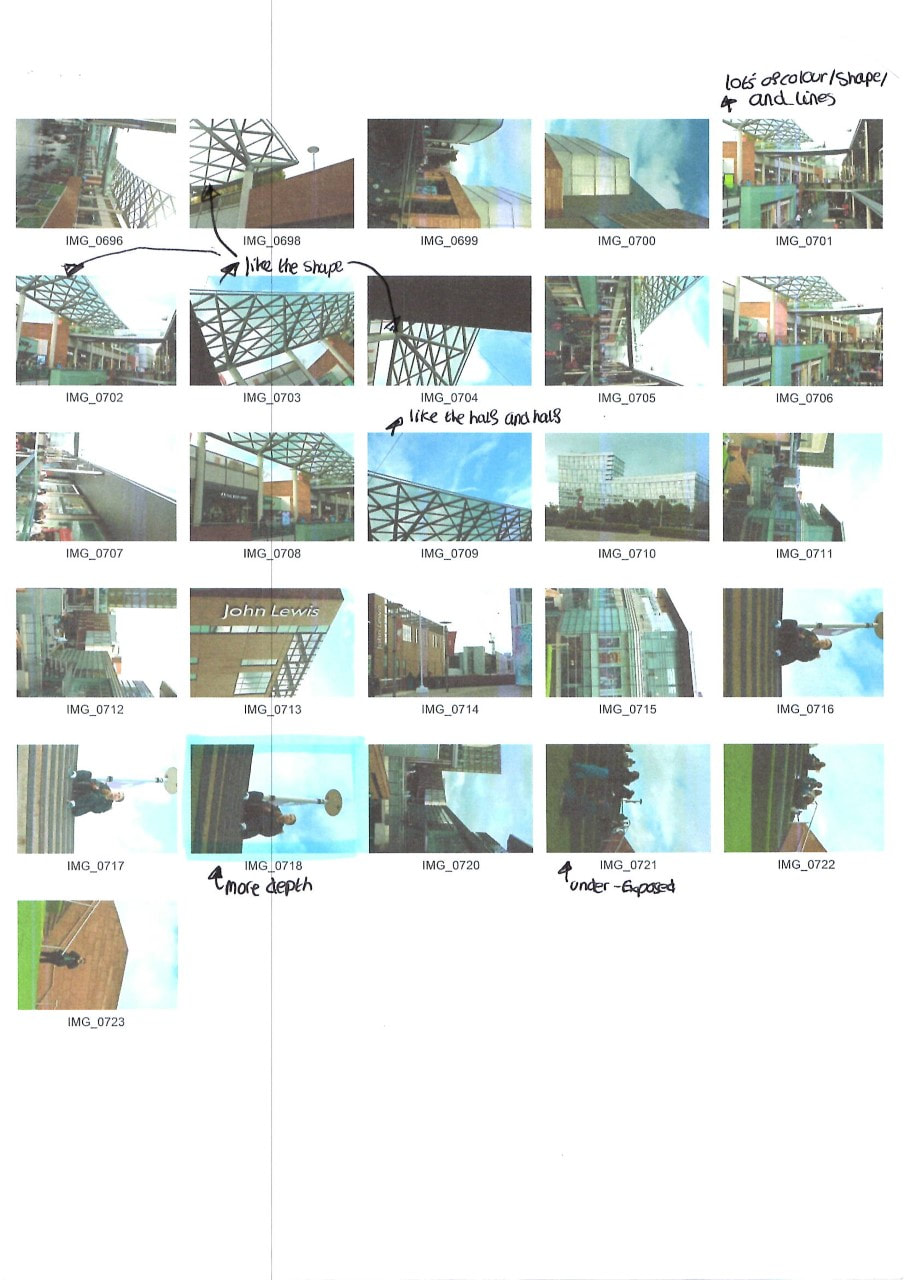
|
Mock exam preparation
Double exposure step by step instructions 1
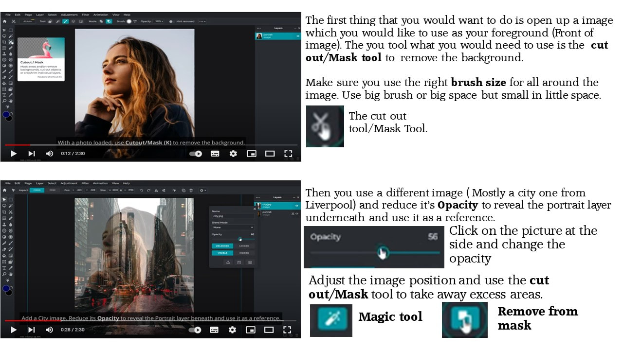
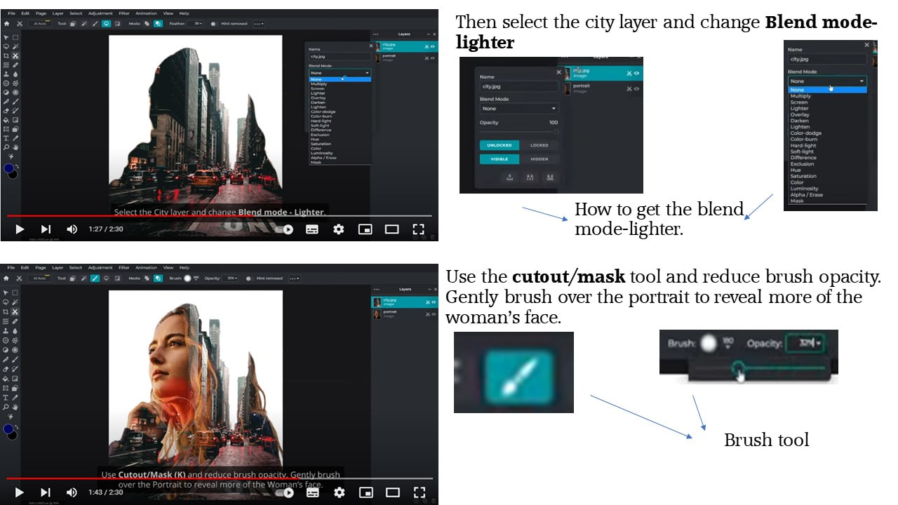
|
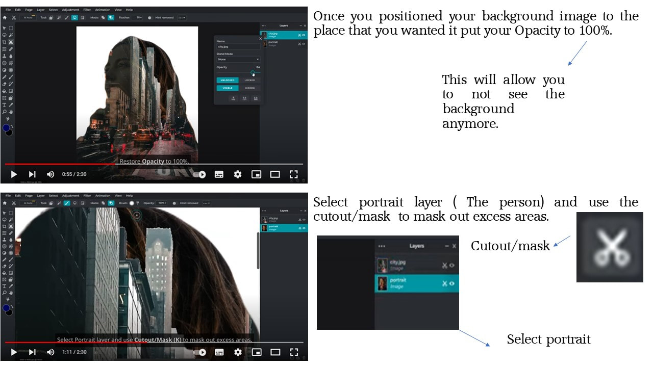
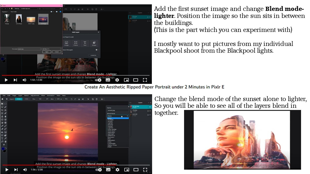
|

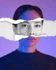
Ripped paper portrait
|
|

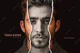
Torn portrait
|
|
Double exposure photographer - Luke Gram
Luke Gram (@lukegram) is an award-winning Canadian photographer. Known for his dreamy multiple exposures, vivid portraitures, and dramatic landscapes, his work casts a wide net that captures memories in a romanticized editing style.
What is Double exposure
Double exposure photography is a technique that layers two different exposures on a single image, combining two photographs into one. Double exposure creates a surreal feeling for your photos and the two photographs can work together to convey deep meaning or symbolism.
What is multi-exposure
multiple exposure (plural multiple exposures) (photography) A photograph produced by exposing film or some other photosensitive surface to focused light more than one time, usually by opening and closing a camera shutter repeatedly, thereby generating a picture consisting of superimposed images.

|

|

|
Shoot Plan
For my mock exam I am expected to use my Liverpool shoot combined with my RGB light shoot. For my mocks I want to get a really good grade so I went a extra mile and did my own shoot at home, hoping it will combine nicely with my other shoots. The other shoot what I did at home was a Blackpool shoot. For this shoot I didn't take any pictures of buildings because I thought I had enough of them when I went to Liverpool for a shoot. But instead I took really nice blurred pictures of people when they were walking past me. To manage this I changed my exposure and shutter speed. I had to change the exposure of my camera because I decided to do the shoot at night time when the Blackpool lights were switched on. I took some lovely pictures of the lights and lots of pictures of people walking around to create a blurred effect.
For the four edited pictures what I am taking a step further with my work. This is because I will be overlaying three or more pictures into one. The only concern is that it might get over distracted so I have to be careful with that when I come to it. I also want to explore monochrome and full colour pictures. Ways I can experiment with theses is that I can combine monochrome and full colour together or do both of them separately. Again I will have a good combination of them on the day of my mock exam.
I also want to experiment with different type of overlays so I can have a future reference if I want to do this style again. Two of these are similar will have a different impact on the audience, as some pictures might be mysterious or scary whereas some might be happy and excited.
Edited images

|
To get this far with my final image I had to do a lot of work to make this one the best work I have done. I tried doing a technique which I loved the ending result from, but it didn't work for this picture so I had to do a different technique which put me of a bit because I didn't have a second plan. The first thing what I did was I used the lasso select tool to get rid of the background. This part was very hard because of all of the tube lights. I did try and get all of the tube lights in but it wasn't possible. The I used the fill tool and filled the background with white so it looks very presentable. After that I added in my second layer which was the Liverpool building and experimented with different blend modes. At the end I used the overlay mode which fitted perfectly for this picture. After looking at the picture for a while I decided I wanted to experiment with monochrome. I didn't want the main image to be black and white otherwise it will loose the colour of the tube lights. So, I decided to change the Liverpool building to black and white and that was a good idea because I really liked it at the end. At this point I thought that this picture needed a little bit more as it looked quite boring to my perspective so, I went to have a look on what is on my SharePoint and found a lovely textured picture. I decided to add it in with the white background and I am very happy that I did that because it compliments with the rest of the picture very nicely.
|
The strengths of this picture is that it is very busy and can catch somebody's eyes because people will be wondering what is in the one picture because there are loads of things in which you can see. The next thing is that I like the way there is a main image in this picture which is the person. I also like the way that the main picture is also brighter than the rest of the pictures which makes the picture sand out a lot more. Lastly, I like the way the building is inline with the person as well because it looks like the person is the building but it actually isn't. To point it out I like the idea of the building being inline the person but also being able to see it and still seeing the tube lights very clearly as some photographers you wont be able to see the building, so that's why I like it. Things on which I can approve on next time I do this is that I could move the building a little bit more down because you can't really see the persons face that much. This would be fine if it didn't have a tube light in the face but because there are both of them in the face it doesn't make things very clearly. I am also quite sad that I wasn't able to use a technique which I loved the ending result of. I thought it would look really nice with it but because of the tube lights it didn't go as plan so I had to do my own technique which was overlaying images and making sure they look nice and presentable.

|
To get this far with my final image I had to do a lot of work to make this one the best image I have done. The first problem I came up with was that the Liverpool Image which I originally going to use didn't really match with the picture what I was going to use. So I had to experiment with different buildings and found one building which links in quite well with my image but it didn't fit amazingly well together. After the experiment and I found a ok image which I can put in this image, I used the blend tool to blend these two pictures together. After I have done that the pictures did work well together at the end. When blending the two images together I found out that this image is quite boring and that I needed to add something in. Once I was looking through m camera role I found a nice image which I took when I was in a art gallery. I decided to crop the picture down and then used the Lasse tool to cut the background away from the colourful rock which blends in very nicely with the two colours on my main image. I decided to add these rocks to the top right of the image and the bottom left of the image. The reason why I did this was because it adds less space to the image but also compliments well with the white dots from the tube lights. I then decided to scroll my camera role to see if anything else could be added to the picture and I found a building which will look amazing with the rest of the pictures. I did have to move it around a bit to find the best place for it but again it was a good decision to make.
|
The strengths in this image is that all of the images contrasts very well together. I wanted this to happen so that non of the images will be the 'left one out' as it didn't match. I like the way that the building contrasts the picture very nicely because the building doesn't really blend in with the image but it looks nice on the image as its giving one side plain and then the other side patterned which looks very appealing. I also think the emotion of the woman contrasts very nicely with the rest of the picture as well especially with those white marks on the front of the image. Things on which I can approve on next time I do this is that don't put two buildings together as you would be able to see one building very nicely and clearly but the other picture you won't be able to see that much but still be able to see small amounts of it peering throughout the image. Before I started this exam I wanted persifically this image to have a ripped paper technique, but it didn't look that nice and I couldn't rap my head around how to do it with one portraiture image and then one building image. This was because on the video it showed how to do it with two portraiture images but not with two completely different images.

|
To get this far with my final image I had to do a lot of work to make this one the best image I have done. It was really hard for me to do this picture because everything went wrong. such as the Liverpool picture didn't match with the person. I did experiment with this picture though. I wanted to experiment with a different colour background. I tried like a dark pink because the background of the woman was dark pink but it didn't go that nicely as it was hard matching a building to the colour and that the colour was to dark for the building.
Firstly, I used the lasso tool to cut around the person so I can delete the background because I am going to change it to white afterwards. Then I decided to use a different background from my other pictures. I chose a train station background because I thought it would fit in very nicely to this picture which it did., but sadly you can't really see it that much. I wanted to add in another background because the train station wasn't enough to fill up the whole white space, so I decided to use a suitable background which will fill up the rest of the white spaces in which it did. Bit now you can't really see the train station that much sept from the roof which has loads of texture, line and shape in it. Once I did all of that I didn't know if I liked the way that the woman is paler, because it looks like she is blending in with the background which I don't want. I did try adding more layers onto this picture but after a bit it got to much so I deleted the rest but still kept the rock which matches perfectly with the colour palette. |
The strengths in this image is that all of the images contrasts very well together. I didn't really want this to happen because I wanted to experiment with images that didn't contrast well together to see how it looked but it ended up like this which I like anyway so I am not complaining. I also like the way that the roof of the train station is acting like a roof to the picture because of the way it is positioned with the building as well. Things on which I can improve on next time I do this is that making sure to plan things before doing it . For this pictured I wasn't very planned well instead it was just layering pictures to see how it looks. Because I have done this, now the audience won't be able to recognise that there is a train station in their. Even though you can still see some parts of it people will still won't know because they will just think that it is a normal roof full of line, shape and texture. Another thing is that the two images don't really link very well together because one's very colourful but then the other one is quite plain and boring as well as the other background which was the train station roof.
Further edits at home

|
To get this far with my final image I had to do a lot of work to make this one the best image I have done. This image was quite easy to do as I already had the images ready for me to use. I also wanted to experiment with this image because I didn't properly know what pictures I really want before taking these pictures. I also didn't really think through with what pictures go with what and how many pictures I will have within one image.
First thing what I did was to remove the background so you can't see the original background because the background won't look really nice with the rest of the image. I used the lasso tool to cut of the person but then inverted it so I removed the background. I did take my time on this so I would make this perfect. This was also hard to do because there is loads of little gaps which you have to get to and you can get scared that you are going to cut some of the person of. After I did this I then changed the background to white so I add layers of images onto my picture. Once I chosen my images I then lowered the opacity so you will be able to see images at the same time and then this gives me time to position my background image so I looks really nice. I then decided to add more background layers because with just one background image doesn't looked finished to me. For the first background image I went with a Christmas tree and then for the second one I decided to go with more of a sparkly one which you can see in the background. For the first image I decided to overlay it which just makes the image fit in with the person. |
The strengths in this image is that it's very detailed which means their is plenty to see for audience and also for the audience makes them wonder what images make up this whole image. I also like the way that the images link in very well with each other because I didn't know how it will go because this was more further editing in my own time. I decided to do this as a Christmas themed because Christmas is just around the corner. I also just took random pictures of Christmassy things which has loads of details in it and a lot of texture as I thought It would would really nice with the RGB light image. Things on which I could improve on next time I do this is to make sure you are able to see the person clearly because it's not that clear because of the background. I could do this by using the cut-out/mask tool and then gently brush the face to show more of it.

|
To get this far with this image I had to do a lot of work which took me a while to do but I am very happy with this because the end result looks amazing. It was very hard to get this far because of small mistakes I did. Personally I wanted this image to be perfect so I couldn't make any mistakes.
First thing what I did was to remove the background so you can't see the original background because the background won't look really nice with the rest of the image. I used the lasso tool to cut of the person but then inverted it so I removed the background. I did take my time on this so I would make this perfect. This was also hard to do because there is loads of little gaps which you have to get to and you can get scared that you are going to cut some of the person off. I then decided to make the background black and white because of how it contrasts well with the black and white image. I then decided to duplicate the image again. Once I did that I then decided to choose a 'ripped' paper effect on google and then added it on with the first Image. While not seeing the rest of the images, I then used the lasso tool again and cut through through the 'ripped paper'. Then I went on the blend mode tool and set the ripped paper to mask which makes the ripped paper go through onto the colour paper. After that I added it onto the black and white paper to make the effect. Once I did the first ripped paper I decided to do 3 more of these which means repeating the whole process again. I also decided to switch things up a bit by adding a different colour to one of the ripped papers while the rest are the same. This makes the image a bit more different which I very much like. |
The strengths in this image is that it's very detailed which means it will catch the audiences eye. I also like the way that the main image is black and white and then the ripped paper colour. If I did it the other way round pit would still look good but wouldn't look that effective then the image above. Another thing which I like is that there's a mixture of colour within the image. If I just used the colours which are within the two images then It wouldn't of been that interesting so I spiced some things up and used a colour which looks like you put a tea bag all over it. I don't really have any weaknesses with this image sept from that I could of chosen a better image which has loads of details in it so then the colour will catch that a lot more.

|
To get this far with my final image I had to do a lot of work to make this one the best image I have done. This image was quite easy to do as I already had the images ready for me to use. This image is mostly the same then the first one because it is the same background but also the same foreground. The difference between those two were the way I layered the two images together as the first one the background covers the whole area of the picture but on this one it covered just the person.
First thing what I did was to remove the background so you can't see the original background because the background won't look really nice with the rest of the image. I used the lasso tool to cut of the person but then inverted it so I removed the background. I did take my time on this so I would make this perfect. This was also hard to do because there is loads of little gaps which you have to get to and you can get scared that you are going to cut some of the person of. After I did this I then changed the background to white so I add layers of images onto my picture. Once I chosen my images I then lowered the opacity so you will be able to see images at the same time and then this gives me time to position my background image so I looks really nice. Then I decided to overlay the background so It is just covering the person. Even though you can mostly see the image through the model but I made sure you are able to see bits of the background in the white background because I didn't want the background just to be white. |
The strengths in this image is that it's very detailed which means their is plenty to see for audience and also for the audience makes them wonder what images make up this whole image. I also like the way that the images link in very well with each other because I didn't know how it will go because this was more further editing in my own time. I decided to do this as a Christmas themed because Christmas is just around the corner. I also just took random pictures of Christmassy things which has loads of details in it and a lot of texture as I thought It would would really nice with the RGB light image. Things in which I could improve on is that I could of added another background image but a bit more suttle so you can still be able to see the person but also the original background image.

|
To get this far with this image I had to do a lot of work which took me a while to do but I am very happy with this because the end result looks amazing. It was very hard to get this far because of small mistakes I did. Personally I wanted this image to be perfect so I couldn't make any mistakes.
First thing what I did was to remove the background so you can't see the original background because the background won't look really nice with the rest of the image. I used the lasso tool to cut of the person but then inverted it so I removed the background. I did take my time on this so I would make this perfect. This was also hard to do because there is loads of little gaps which you have to get to and you can get scared that you are going to cut some of the person off. I then decided to make the background black and white because of how it contrasts well with the black and white image. I then decided to duplicate the image again. Once I did that I then decided to choose a 'ripped' paper effect on google and then added it on with the first Image. While not seeing the rest of the images, I then used the lasso tool again and cut through through the 'ripped paper'. Then I went on the blend mode tool and set the ripped paper to mask which makes the ripped paper go through onto the colour paper. After that I added it onto the black and white paper to make the effect. Once I did the first ripped paper I decided to do 3 more of these which means repeating the whole process again. I wanted to experiment with just one colour of ripped paper. |
The strengths in this image is that it's very detailed which means it will catch the audiences eye. I also like the way that the main image is black and white and then the ripped paper colour. If I did it the other way round pit would still look good but wouldn't look that effective then the image above. I don't really have any weaknesses with this image sept from that I could of chosen a better image which has loads of details in it so then the colour will catch that a lot more.
Final Outcome

|
Strengths
The strengths in this image is that like the way that the ripped paper is in a different colour then the background image. I like this because it makes the image stand out a lot more than other images as from far back you may only be able to see the coloured pieces and then when you move closer then you get to see the whole image as the whole. Weaknesses The weaknesses in this image is that I wish I could brighten up the background image a bit more. At the moment it is a bit to dark as you can't catch that much detail of the body that much. To improve on To improve on next time I would like to experiment more with different images while also experimenting with different sizes of ripped paper. I would also like to experiment with doing the opposite colours so the background image will be colour and then the ripped paper will be black and white. |
Evaluation
Firstly, I researched the work of Emma-Leone Palmer. I really want to choose her as my first photographer for the portrait and identity topic. The reason why I chose her is because she is a lot more different from the rest of the photographers later on in the topic. This is due to that she isn't a photographer but she is actually a artist, but still decided to pick this song due to how well it fits in the topic. This inspires me because she doesn't really show just the face but instead makes her painting there face but their body as well. Through studying this artist, I was able to explore concepts of colour, texture and line in my own photography examples. Inspired by their work, I created a series of emulation by getting different kinds of LED lights to wrap around the body/head, but then I could also use a light projector to fill up more of the space surrounding the model with more light so it will be eye catching to the audience. To do this I did ask my model to take of her school jumper so her clothing won't distract the image even more otherwise the image would go completely wrong as their is already loads of colour within the image and the exposure won't let in anymore light. Once the background is set up with the backdrop due to not wanting the background to distract the audience, I started to ask my model to do some different type of poses to fill up the space and by doing this it moved the LED light tubes around so they are not in the same place in every single image. Overall I was very happy with the results of this photoshoot, due to how many good pictures me and my mates took.
When doing the photoshoot, I decided to choose these photos and I did lot's of editing to them for example I put some ripped paper on and make that coloured while the main picture is monochrome. I personally think when I edited them for my year 11 mocks I made them a lot better then when I did the photoshoot at the start of year 11. I am really happy with how far I got with photoshoot and also further editing them late on in the course.
I investigated the technical processes of conceal and reveal. Overall the equipment on what I used for this experiment was a DSLR Camera, A transverse Tripod, A backdrop(White) and some back lighting(LED lights). Their work helped me understand the theme of portrait and identity by using cheap lights and creating some incredible images from them. Emma-Leone Palmer has helped me explore the theme of portrait and identity by not just taking picture of people faces but also taking pictures of their body as well because a lot of people may hate the way their body looks and stuff but I think Emma-Leone Palmer is sending a message to them and saying that its good that all body's are different and unique as all human beings are different and they need to express their body's.
Secondary, I researched the work of Laura Williams focusing on overlaying images onto each other while still understanding the theme of 'reveal and conceal'. I was inspired by Laura Williams work due to how unusual her photographs are and that their is plenty to see while looking at her work which in a result the audience wouldn't find boring, but instead interested and wondering what has happened in this photo. I very much like these kind of photographs as they are quite fun to do a photoshoot with but sometimes can be very complicated editing them and making them perfect at the same time, but the end results are just like doing the photoshoot and gathering all of the photos up they are very happy/fun images for the audience to look at and to have fun with your friends while doing the photoshoot. Through studying this artist, I was able to explore the concepts of colour, texture and shape in my own photography examples. Inspired by their work, I created a series of emulations by getting a friend and making them stand in one persific area while holding a big mirror. I then took multiple photos while experimenting with different areas of holding the mirror for example: I asked the person to hold the mirror high so it covers the whole face and hair area, I then asked them to do the same but this time put the mirror to a slant and instead of covering the whole face I asked them put the mirror where I can see one of the eyes, but the rest of the face still covered up and then lastly I asked if they can put the mirror a bit further down so I can see the whole of the face but this time some parts of the body is covered up. Once I have took multiple pictures I then asked the model to move to one side while I am standing still. I then took more pictures of just the background so then I can emulate it onto the mirror. After doing the photoshoots I then went onto Pixlr and started editing the background images with the images with the person in it. It did take me a while to do this because I only wanted to remove the mirror bit of the background so I could add in the plain background. The reason why I had to stay still is because I wanted the background to match with the background with the model being in it otherwise the finished results wouldn't go that good because of the backgrounds not being able to match. The skills which I was able to develop in this was being able to edit the images fully on PIXLR because editing those pictures were very complicated and that I needed to watch a YouTube tutorial to get to the finished product. Their work helped me understand the theme of portrait and identity by showing a different side of it as other photographers just showing a face with LED lights wrapped around them just like Emma-Leone Palmer . Instead she is using a unusual side of portrait and identity as she is showing the whole body of her model whereas in other photographers I have discovered they have only being able to show the face of the model to show more emotion. Instead she is using the background to show her emotions within her photos.
Lastly, I researched the work of Luke Gram focusing on double exposure for my year 11 mock exam. I was inspired by his work because of the way he uses double exposure. He uses it inside the frame of the person and then leaves the background white in which I find that very effective for the audience as they will be able to focus on one thing rather then multiple things. Being inspired by his double exposure made me come up with me doing different types of double exposure within my year 11 mock exam. Through studying this artist, I was able to explore the concepts of shape, space and colour in my photography examples. Inspired by their work, I created a series of emulations by using images from previous photoshoots such as the Liverpool shoot and then the RGB tube light photography. To do the double exposure I needed to do some research on how to do it on PIXLRE. At the end I found three really good ways on how you can represent double exposure in your photography work e.g. Ripped paper effect. Once I did a PowerPoint on a step of step tuition on how to do it, I was ready to do my year 11 mock exam. During the mock exam I founded the tuitions very hard to do and in a result of that I was running out of time. At the end I just decided to do overlays of the images which means just adding pictures onto one picture and then overlaying so it you will be able to see past images. The end result will look like multiple images in one whole images. At the end of the mock exam I wanted to experiment further so I decided to take some pictures of the Blackpool lights and some pictures of Christmas decorations from when I went to a garden centre with family. When editing these pictures I still wanted to overlay them onto the RGB tube light images from the photoshoot because I thought it would be very effective as some of the colours matched with the Christmas decorations. Once I've done around two of those images I wanted to have a go at the ripped paper effect as I didn't get chance to do it during mock exam. How I did it was I got one of my portrait images and had one with colour and then one without colour (Monochrome). After that I looked on google for a ripped paper effect and then uploaded it onto PIXLR E. Then I had to go onto blend mode and then clicked on the mask tool and that what made the black and white image go within the ripped paper. I did that a couple of times but instead of monochrome I decided to do a different colour and I think that made it very effective for the audiences eyes. I investigated the technical processes of Overlays while using the equipment of PIXLR E and a DSLR 4000 camera. Their work helped me understand the theme of portrait and Identity by showing the person on the image their true colours of what is happening behind the camera. I feel like his work is quite unusual while its a unusual process to get the portrait and identity out there to be shown and seen. His work links in with the topic as it is showing the persons feelings within colour and his unusual technique.
Firstly, I would like to point out that for this composition I think that I laid it very well especially when I've a photoshoot and I needed to organise it will 8 pictures in a gallery form, then the four best images when edited and then explaining how I got that far and then finally my final piece in which I would have to talk out my strengths and weaknesses and what to improve on moving further within the component. This helps as its just like a step to step on what I did within the photoshoot.
I feel like that my outcome for my year 11 mock exam was the most successful. I felt like this because of how much extra work I did to make this component perfect, for example taking background images and then editing them to make final outcomes for my mock exam. For my final outcome for this mock exam I found that the colour and lighting is really good in the image as there is a good contrast between light and ark lighting. I also think I used the correct exposure as the background image is quite dark so the colour of the ripped paper would stand out a lot more. The viewpoints on this image is very creative as I am using ripped paper effects to be added on my image to create a creative effect while using different colours within the ripped paper. For the year 11 mock exam I feel like as well that I planned it very well as I already knew what pictures I wanted to use together and what technique I wanted to use with this image.
Areas of improvement for this component will be to improve on my physical editing skills because I struggled a lot from it when It came to my mock exam and I don't want that to happen again for my real exam as it costed a lot of my time. I'm fine with editing just one single image with editing the exposure, its just doing techniques while using PIXLR E for example the ripped paper effect. Even though I know how to do it know but I didn't know how to do it when put in time pressure so I need to practise that again for my final exam. I will also need to improve on my physical editing skills as I feel during this component it was a bit messy due to the blue tack being very sticky which end up for the paper to rip. I did as well had to try and edit that out but I didn't really know how to do it and if I did do it then it would make a big mess of the picture as a whole. It wouldn't be a tiny mistake that you wouldn't see straight away it was a big mistake in which you could see from a mile back.
